




Firedog
Super User
Super User
May 21, 2024

Comparing usage with similar homes

  • May 21, 2024
  • 15 replies
  • 331 views

It may be helpful for customers to see how their own energy consumption compares with other people’s in similar circumstances, possibly even prompting a change in behaviour in order to keep up with the Joneses. OVO now provides two options for seeing this comparison: under Energy insights in the online account, and under Usage in the shiny new app. 

I don’t really expect my usage pattern to match anyone else’s, because I don’t expect there are many more just like me in this part of the world. However, I would expect the ‘similar homes’ to be reasonably similar in the two places. Sadly, they’re wildly different:
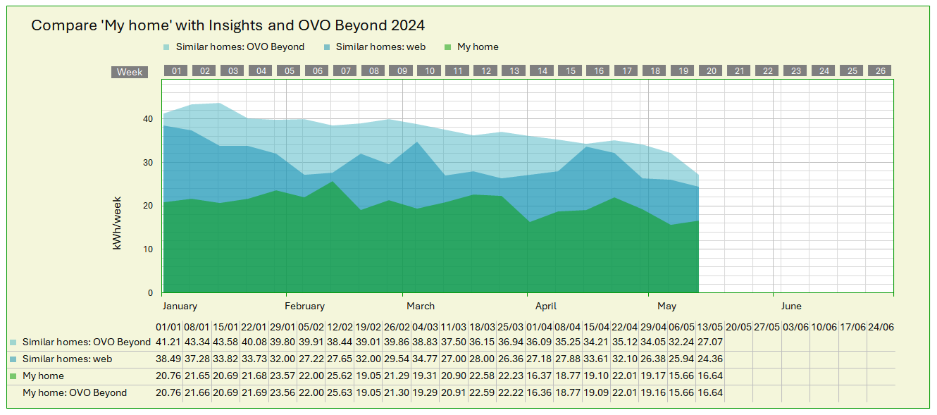
  

Usage in kWh per week
A click on the image should bring up a more legible version

 
The divergence between my own usage pattern (the green bit) and everyone else’s is difficult enough to explain, but I put it down to my being eccentric 🙂. However, the variance between the blue fields is quite striking, and indicates that there are totally different parameters applied to arrive at an average value for homes similar to mine. About the only thing they have in common is a decline from January to May - surprise, surprise!

There may be some smoothing applied to the light blue curve, to minimize the distortion that short-lived events like Easter would otherwise introduce. But that OVO Beyond’s figures are consistently significantly higher than those from the web indicates a more fundamental disparity between the datasets behind the figures.

I’ve been told that OVO Beyond looks only at properties in the same (DNO) region; has anyone else, perhaps in other parts of the country, been struck by this dissimilarity of allegedly similar homes?

 

15 replies

Abby_OVO
Community Manager
Community Manager
May 22, 2024

What a great post @Firedog, thank you for taking the time to put all of this together!


Some really interesting data especially comparing those to the ‘similar homes’, there’s quite a difference there.


It would be interesting to know how others’ compare to their ‘similar homes’.

Currently Playing: She's Electric
Firedog
Super User
FiredogSuper UserAuthor
Super User
July 27, 2024

Two months on and no-one has come back to confirm or refute my allegations 😥

I’ve had a bit of to-and-fro with someone at OVO who might have something to do with one or the other of these features, sadly with no real explanation or indication of why this striking discrepancy exists. And it’s still there. Last week, for example, Insights shows this:


while on the app I see:


Where the heck does this 23.93 kWh / 32.29 kWh difference come from? 

Has no-one else noticed anything of the sort?

In any case, the comparison isn’t serving any useful purpose, unless there’s a substantial difference between OVO homes and others. That’s a different issue entirely ...


[I can’t reproduce the Beyond figure of 17.22 kWh for my own consumption. It’s only 10 Wh different from what I think it should be, and what Insights thinks it is, so the difference is hardly significant. I’ve looked at the BST shift in usage data (which gives 17.207), but meter readings and GMT usage data give 17.232 and 17.231 respectively. This sort of 10 Wh discrepancy occurs in several other weeks this year, so I wonder where Beyond is getting its figures from, quite apart from those for similar homes.]

Noel | I have no official status; I'm just a volunteer who comes here to help other customers. My gear: Aclara SGM 1416-B Electricity-only E7 meter; Chameleon IHD3-PPMID-AAA | It may look as if I know what I’m talking about, but don’t let that fool you. |
Super User
July 28, 2024

Hi @Firedog 

Must confess I never noticed the difference between app and web before but now you mention it…

  Gas Electricity Web App
Me 29.31 44.04 73.35 73.35
Similar 60.75 66.20 126.95 98.28


I was always confused by the CO2 comparison graph

I have converted last years energy usage to CO2 equivalent and get

  • Gas 1.77 t
  • Electricity 0.73  t (30%)
  • Total 2.4 t

For similar homes this is

  • Gas 2.50 t
  • Electricity 1.2 t (32%)
  • Total 3.7 t

I assume the comparison must be over all properties.


Annually: Petrol 1315l to 442l, Electricity 3779 kWh to 2465 kWh, Gas 17,853 kWh to 9128 kWh. 20 years of monitoring and tweaking.
Nukecad
Super User
Super User
July 28, 2024

Ah, but is that average, mean, or median usage?

It's all smoke and mirrors anyway, depends on who is trying to sell you what or persuade you of what ideas.

Statistics can be twisted to support just about any position or argument.

I said, Hey - Watts going on.
Firedog
Super User
FiredogSuper UserAuthor
Super User
July 28, 2024

​​​​Must confess I never noticed the difference between app and web before but now you mention it…


Striking, isn’t it? Thanks for checking!


​​​​I was always confused by the CO2 comparison graph...


Me too. Mine has never changed ever since I first looked, whenever it was first introduced I suspect - always 0.1 t (electricity only).

Even that is suspicious. When I looked this morning, I saw that in the emissions data for my region, 7.5% of them was from coal (!) and something over 40% from gas. No wind (but then it was dead flat calm at the time). The coal has gone again now.

I suppose Ratcliffe (just 30 miles away) has to use up all the coal that was shipped in a couple of weeks ago before shutting down in a few weeks’ time.


Statistics can be twisted to support just about any position or argument.


Yes, but this is supposed to be a helpful comparison. I can’t see what argument OVO might be trying to make by distorting statistics like these. There must be a major difference in the source of data and/or the filters used to arrive at such disparate figures. I’m glad not to be alone in this disjointed world!


Noel | I have no official status; I'm just a volunteer who comes here to help other customers. My gear: Aclara SGM 1416-B Electricity-only E7 meter; Chameleon IHD3-PPMID-AAA | It may look as if I know what I’m talking about, but don’t let that fool you. |
Nukecad
Super User
Super User
July 28, 2024

LOL, distorted data sources, filters, and subsequent calculations.

I'll just say FACs.

Edit to add- “Computer says …..”

I said, Hey - Watts going on.
Jeffus
Rank 20
Rank 20
July 29, 2024

The app and website have shown different figures since the feature was launched.

We pointed out the difference at the start on the forum.

The original reason given was due to the different IT code release versions between the app the website, but the calculations have never been aligned since then.

I can't imagine there is any work going on to do this after all this time. I expect they will never align now.

Firedog
Super User
FiredogSuper UserAuthor
Super User
July 29, 2024

The app and website have shown different figures since the feature was launched.

We pointed out the difference at the start on the forum.


I didn’t know that! Any chance you could find the reference so I can see what people said back then? I’m not even sure when ‘the feature was launched’ - was it simultaneous in the app and on the web?

Last month I learned from ‘the team’ that “after an in depth look into this we find that one of the models used is a bit outdated which we are looking at replacing or removing. Specifically, one of the similar homes models is out of date. We are possibly looking at updating or removing this model.” No indication of where the out-of-date model was being used - web or app.

Noel | I have no official status; I'm just a volunteer who comes here to help other customers. My gear: Aclara SGM 1416-B Electricity-only E7 meter; Chameleon IHD3-PPMID-AAA | It may look as if I know what I’m talking about, but don’t let that fool you. |
Jeffus
Rank 20
Rank 20
July 29, 2024

The app and website have shown different figures since the feature was launched.

We pointed out the difference at the start on the forum.


I didn’t know that! Any chance you could find the reference so I can see what people said back then? I’m not even sure when ‘the feature was launched’ - was it simultaneous in the app and on the web?

Last month I learned from ‘the team’ that “after an in depth look into this we find that one of the models used is a bit outdated which we are looking at replacing or removing. Specifically, one of the similar homes models is out of date. We are possibly looking at updating or removing this model.” No indication of where the out-of-date model was being used - web or app.

Three years ago there was a conversation about differences between the app and the website

I suspect it is one of those features that look good in press releases and advertising but in reality is rarely used by customers to make informed decisions.


Firedog
Super User
FiredogSuper UserAuthor
Super User
July 29, 2024


Three years ago there was a conversation about differences between the app and the website


Thanks. I only see a discussion about the difference in emissions; they’re not particularly interesting when an all-electric household will always show the minimum possible, because OVO claim that all the electricity they supply is renewable and thus carbon-insignificant.

I’m concerned about the difference in consumption of homes similar to mine. The app says it takes into account region, property type, no. of bedrooms and types of fuel. I can’t find the same information about the website’s Insights, but I’d be surprised if their filters are very different. So how does one lot get to a figure 35% higher than the other?

Noel | I have no official status; I'm just a volunteer who comes here to help other customers. My gear: Aclara SGM 1416-B Electricity-only E7 meter; Chameleon IHD3-PPMID-AAA | It may look as if I know what I’m talking about, but don’t let that fool you. |