

Open for votes
Improve Greenlight's carbon forecast on OVO app
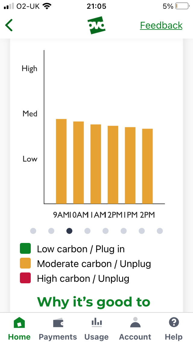
The carbon forecast on the OVO app shows 6 hourly time slots per screen, which have to be swiped through a block at a time, so 7 swipes to show the whole 48 hour period. By the time I’ve moved a couple of swipes I’ve lost track of which day the times are referring to, particularly when the text labels run into each other and become unreadable.
If the graph was turned through 90 degrees the time slots could run down the screen, labels would be one per line and if day names could be included eg at midnight the whole thing would be more readable.