


Open for votes
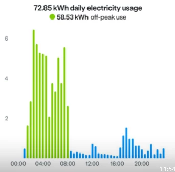
Break-Down of Daily Electricity Usage Graph to Total kWh and Off-Peak kWh
I note that some of your competitors use different colours on the Daily Usage Graph for Peak and Off-Peak Electricity Usage. Additionally, on the Daily Electricity Usage Graph they show both Total kWh as well as Off-Peak kWh. This is a very useful information to have as it informs customers as to the usage and can then adjust their usage to become more efficient.