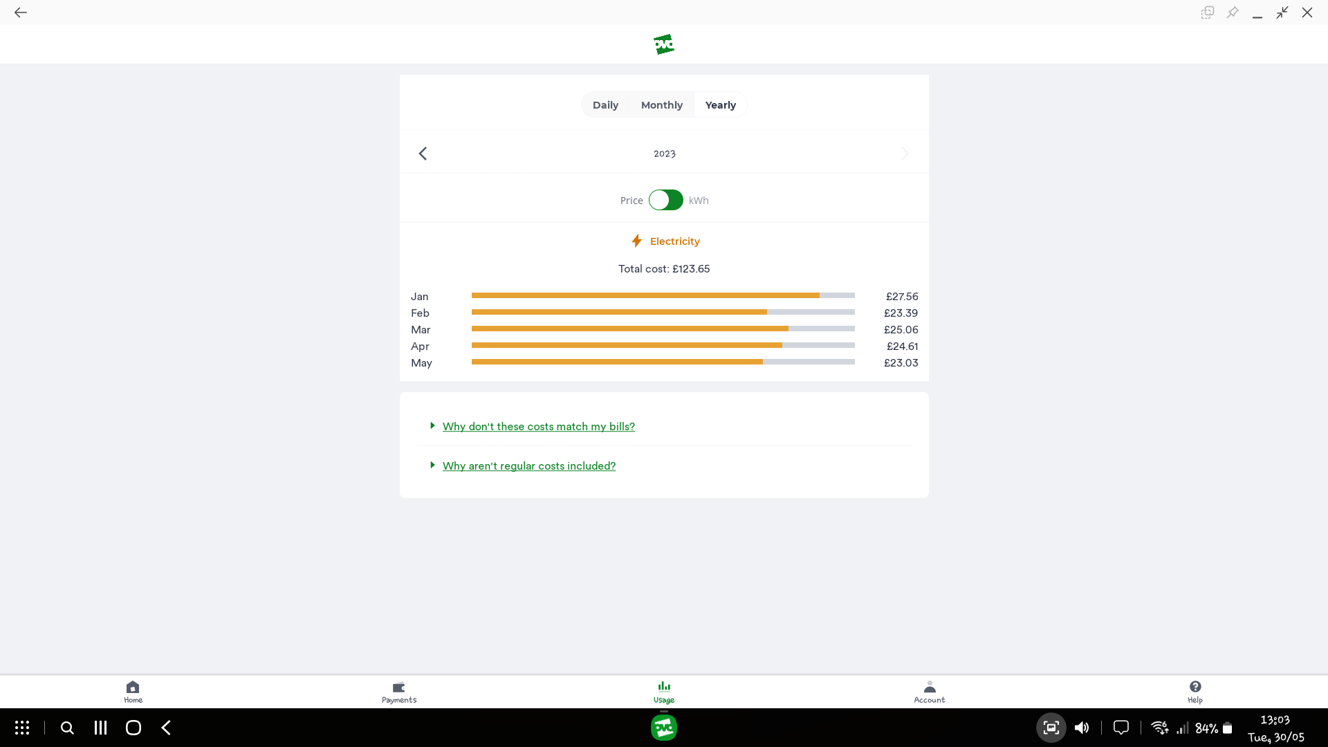
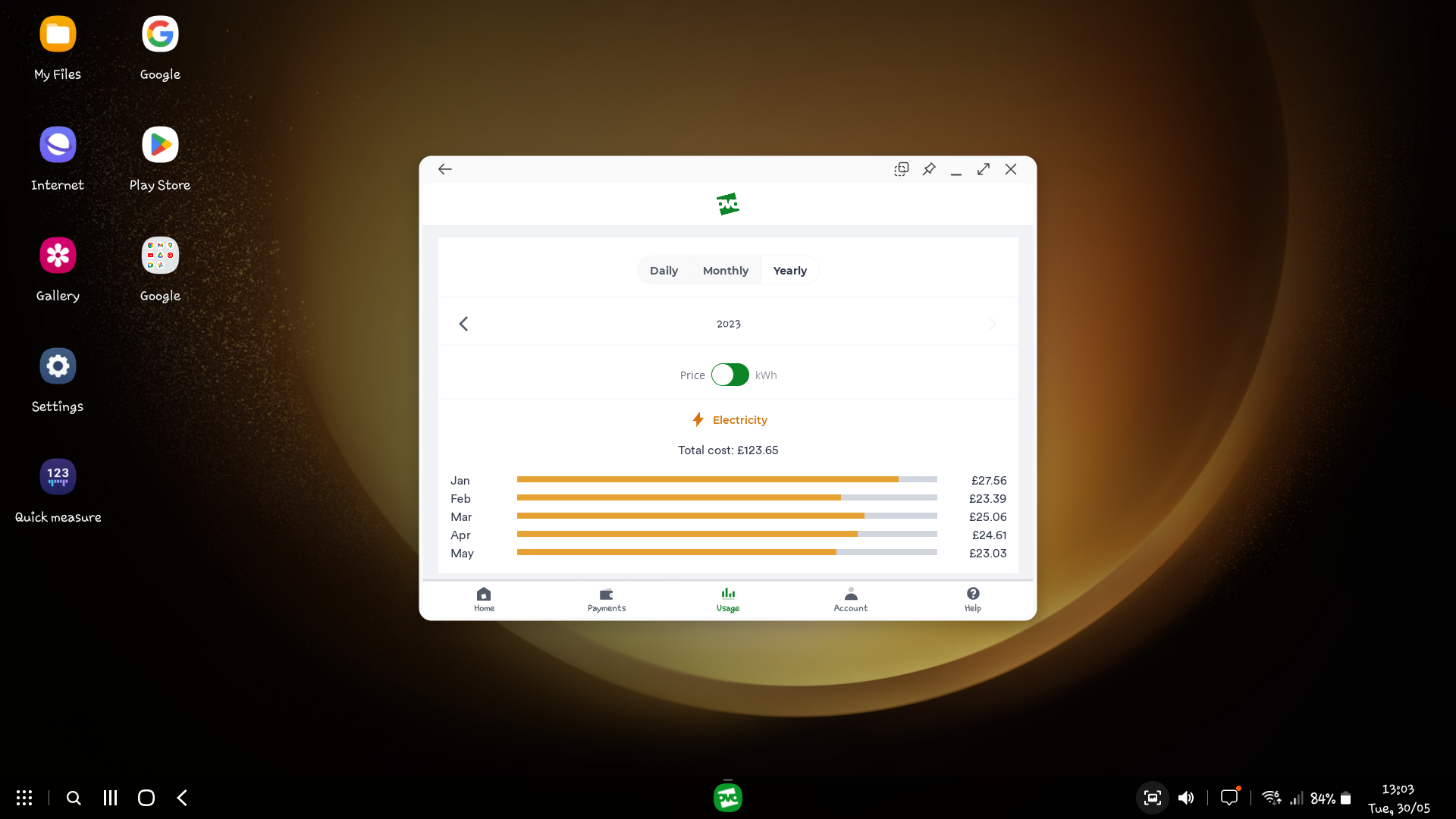
Recently, I’ve been making more use of Samsung DeX on Dewott for various reasons, not least because it provides even more unique ways to break the OVO apps. :)
The OVO Energy app works fairly well on DeX, but it would be nicer if I didn’t have to move my mouse through an entire city just to switch between Payments, Usage and Account tabs. If the app could also scale up a bit better to take advantage of the available space, that would also help a lot when using it via DeX or on any larger screen.


