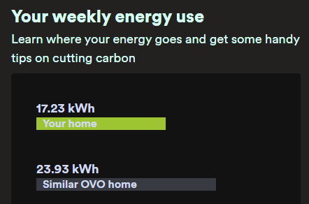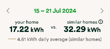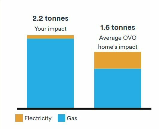


It may be helpful for customers to see how their own energy consumption compares with other people’s in similar circumstances, possibly even prompting a change in behaviour in order to keep up with the Joneses. OVO now provides two options for seeing this comparison: under Energy insights in the online account, and under Usage in the shiny new app.
I don’t really expect my usage pattern to match anyone else’s, because I don’t expect there are many more just like me in this part of the world. However, I would expect the ‘similar homes’ to be reasonably similar in the two places. Sadly, they’re wildly different:
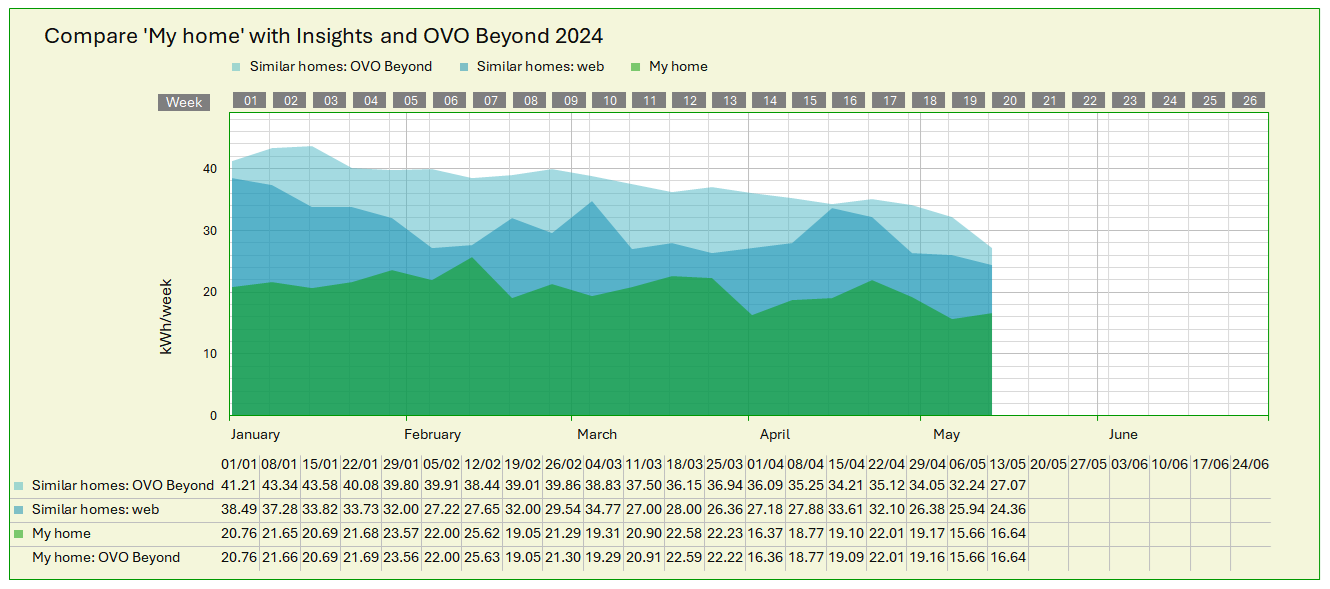
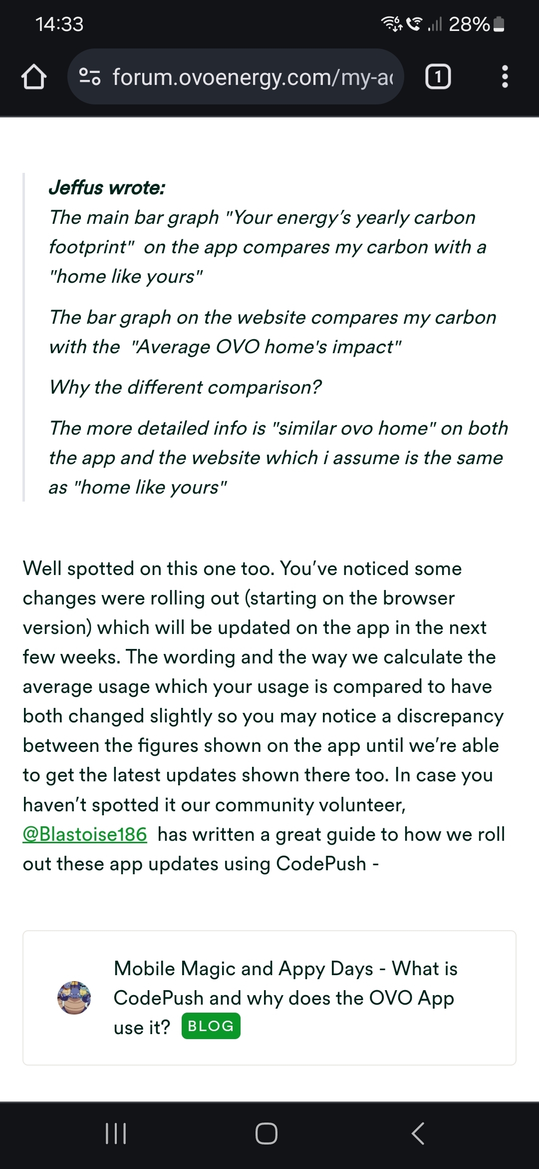
A click on the image should bring up a more legible version
The divergence between my own usage pattern (the green bit) and everyone else’s is difficult enough to explain, but I put it down to my being eccentric 🙂. However, the variance between the blue fields is quite striking, and indicates that there are totally different parameters applied to arrive at an average value for homes similar to mine. About the only thing they have in common is a decline from January to May - surprise, surprise!
There may be some smoothing applied to the light blue curve, to minimize the distortion that short-lived events like Easter would otherwise introduce. But that OVO Beyond’s figures are consistently significantly higher than those from the web indicates a more fundamental disparity between the datasets behind the figures.
I’ve been told that OVO Beyond looks only at properties in the same (DNO) region; has anyone else, perhaps in other parts of the country, been struck by this dissimilarity of allegedly similar homes?