

Anyone who has export capabilities from their home system…. so those with solar panels or other generation and those that are part of the Vehicle to Grid experiments will have discovered that the usage data currently supplied is useless because half of the story is missing! The data currently only shows what has been purchased from OVO and excludes any exports. So if it is a sunny day, you may see a reading of 0.01kWh for a 30 minute segment… In practice your solar generation might be 1 or 2kWh for the same period. At present, it is impossible to know what you have used and what has been exported… you only know that you must have peaked the export value for a few seconds at some point…. perhaps if you boiled the kettle or because the sun went behind a cloud! So in practice the data does not tell you what you have used at all, even if you know what you generated, you may have used none, some or all of your generated power!
If the export data from the Smart Meter could be added to the usage screen, perhaps as a negative bar on the chart, along with a line graph showing the aggregate of the import and export, those who need it will actually be able to work out what they are using at home. For those who don’t - as it is all zero’s - it will just not appear.
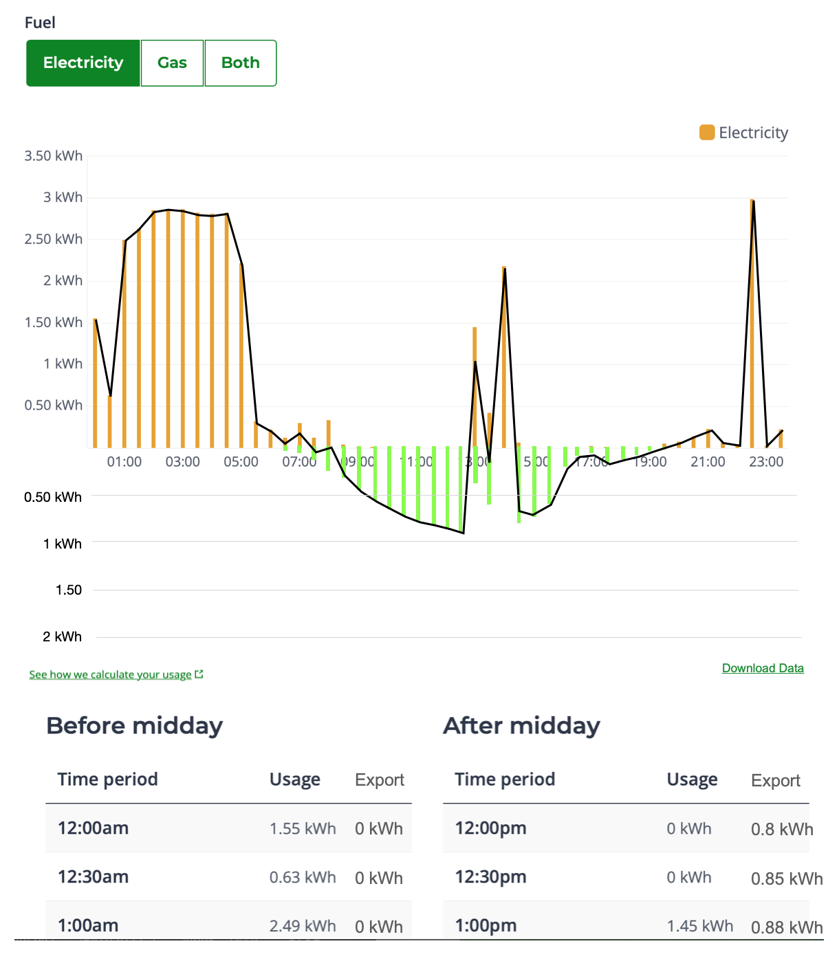
Below is mock up of what it might look like, using a screenshot from my own log in and guessed data for the imports and exports. Exports (my surplus production) are the green bars, and imports (what I buy from OVO) the usual orange ones. The Black line shows the aggregate of the two combined. Most spreadsheet/database/website graphing plugins could offer a similar looking layout, so I’m sure it would not be difficult to implement…
If a link to download the data (as shown at the right of the data table) could also be added (perhaps as a CSV file), it could be used in a spreadsheet along with generation data from the other systems (PV, EV, etc.) to see exactly how much power you used, where and when.