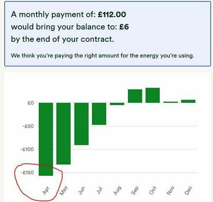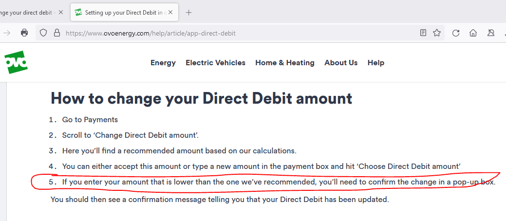


The Direct Debit calculator is a valuable tool, but it is far from perfect. One major drawback is its attempt to mislead by fudging the graphic representation of the account balance. Here is today’s for my account, a fixed-rate plan ending in May next year:
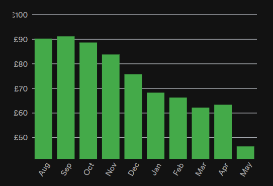
This looks quite reasonable: the current DD takes account of my current balance and shows it coming down to not much by the end of the fixed term, with a recommendation to reduce the DD a bit to make the end result closer to zero. I might be tempted to leave things as they are, to be on the safe side.
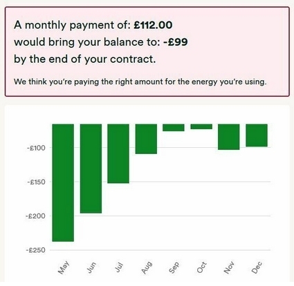
… until, that is, I notice the disgraceful shift in the y-axis that distorts the picture significantly. By shifting the origin to some arbitrary figure over £40, it leads me up the garden path. In fact, the average balance over the next nine months would be about £77, 2½ times the recommended DD.
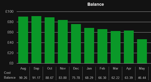
This could be regarded as a gross manipulation of the data to the customer’s detriment and ought IMNSHO to be corrected. This is what I think the chart should look like:
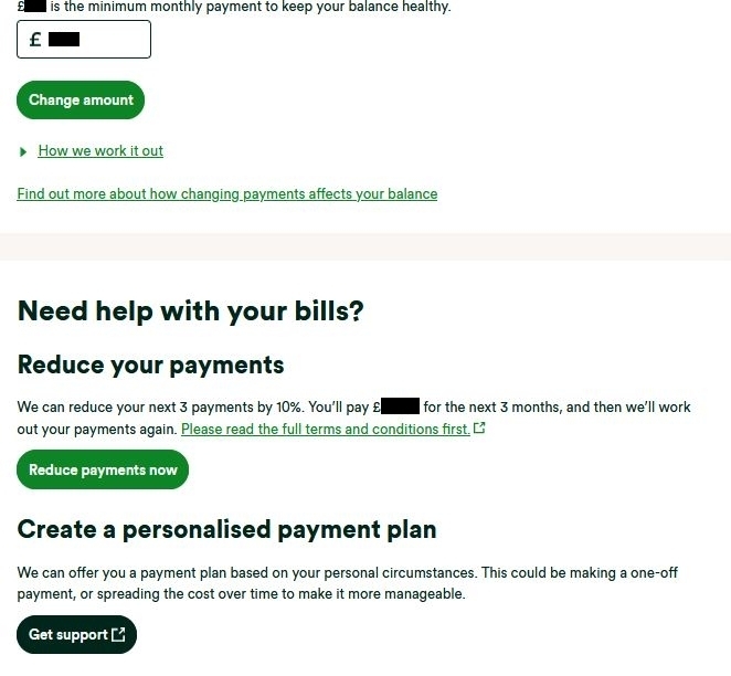
In cases like this, where a substantial credit balance has accumulated by virtue of a too-high DD over a long period, the calculator should perhaps recommend taking a refund of some of the credit as an alternative to (or as well as) reducing the monthly DD.