A graph on the app/website that shows if you’re on track for hitting the Power Move target for the month. Updated daily/hourly/as often as feasible.


Running tallies should be available for all challenges. An update halfway through the month is not good enough, and customers should not have to manually add all their half-hourly slots together using excel.
Thanks, @ima,


This seems like a cool feature. I’ll change the status of this to ‘Open for votes’ and see if it gets much interest. 


To all Power Movers, now is your time! 


NewOpen for votes

Definitely would help as it can be difficult to see if we are making the cut


A graph on the app/website that shows if you’re on track for hitting the Power Move target for the month.


Can you suggest what such a graph might look like? 

The problem is that it’s a moving target. The graph would have to use whatever data it has to predict the total weekday consumption for the month, then compare current peak consumption to this prediction. It’s likely to vary wildly the first few days of the month, settling down to a pattern as more data points are added - so long as there is a pattern, that is.

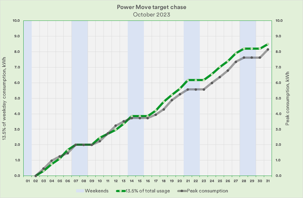
Here’s just one suggestion, modelled on a limited-over cricket match’s run chase (commonly known as a worm:


The grey line has to be below the green one to be on track for earing the reward. A bit of a shaky start here, but pulling my socks up half way through the month seems to be paying off.

What would your graph look like?


Hi @Firedog, thanks for the reply!

A graph like the one in your example would work great. Anything to show if a customer is on track to meet target.

It does not even have to be a graph, a simple statement of what percentage of usage is inside of peak hour would be perfect. The problem is that such a metric is only given once during the month (halfway through via email). I’d like to be able to get this metric on-demand.

I hope this makes sense.


The following idea has been merged into this idea:

All the votes have been transferred into this idea.

Here’s the original feature idea, @webbo247 - your feature votes have been added to this one!


@ima ​@Broken2 - Happy to report that users should now be able to see weekly running updates via the app as of October 2024.


Although not in graph form, users should be able to see a weekly update of their rolling score!


🎉


Open for votesCompleted

It does not even have to be a graph, a simple statement of what percentage of usage is inside of peak hour would be perfect … I hope this makes sense.
 

I know it’s a long time since this was posted, and I’m sorry I didn’t react then 😚

You may find that ​@Tron Burgundy’s little utility does just what you were looking for. It’s been updated to work with this quarter’s criteria, and it works perfectly for me:
Ovo-Power-Move-Calculator · GitHub