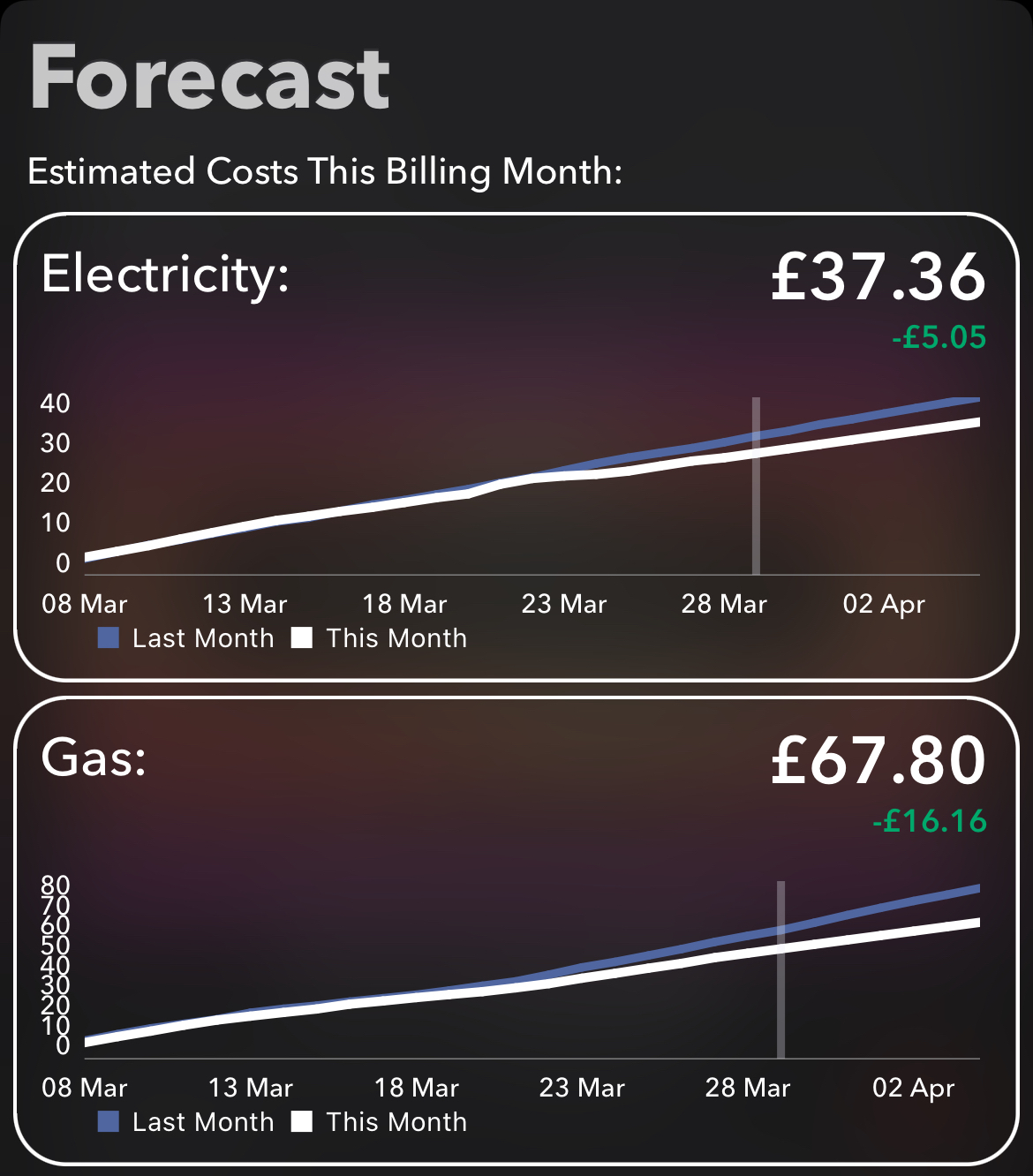


Many customers could benefit from seeing during the billing period how big the monthly bill is likely to be at its end.
There are many ways of estimating a future figure based on historical ones, so it would take a bit of work to find the ‘best’ model. I’ve been testing a couple recently, with quite satisfying results:
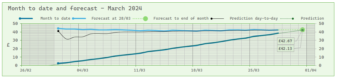
Here we have a forecast (the pale blue line) which takes the average usage for the preceding 28 days and calculates the final bill amount if the same average daily usage persisted to the end of the period.
The thin dark line takes the average daily usage from the beginning of the period and uses that to predict the final bill. This will naturally be wildly inaccurate in the first few days, but it gets more reliable the more days that pass.
The dark blue line tracks the period’s usage, which in my case soon proves to be a slightly wavy more-or-less straight line. Projecting this line to the end date gives an estimate of the final bill. The thin dark line is just a representation of the projection’s result on any particular day.
We can see that the two methods just about coincide around the middle of the month, and the values thereafter are just about equally reliable. The 28-day projection will of course lose precision after the 28th day of the period compared with the other one, but by then it’s immaterial - it will be clear where the bill is heading.
Why 28 days for the first forecast? Most major usage fluctuations patterns happen over a short period, e.g. a bank holiday weekend. Calculating an average over a longer period will give this sort of short-term fluctuation only the prominence it deserves. Other major changes - an increase or decrease in the size of the household, say, or taking an EV charger into use - will naturally affect the outcome, but step-changes will be evened out by averaging over a few weeks.
I chose 28 days rather than a whole month, because we’re creatures of habit and our usage patterns are to some extent governed by the day of the week. When Sunday’s usage is added in to the mix, it will be a Sunday four weeks earlier whose usage is taken out of the mix. This will for most households give a more accurate average for the four weeks concerned.
However the estimate of the final bill is arrived at, it could be shown on the current billing page with a note to the effect that ‘if you continue to use energy at the same rate as you have done recently, we predict that your next bill will be about £42. This includes VAT, but no other adjustments to the amount such as rewards or charitable donations.’