Add a confirmation step to the "one-click renewal" tool

Related products: Online account

I don’t usually like to claim credit for other people’s ideas, but there are a few edge cases where I feel it’s appropriate if I’ve given others a chance. This feels like one of them.

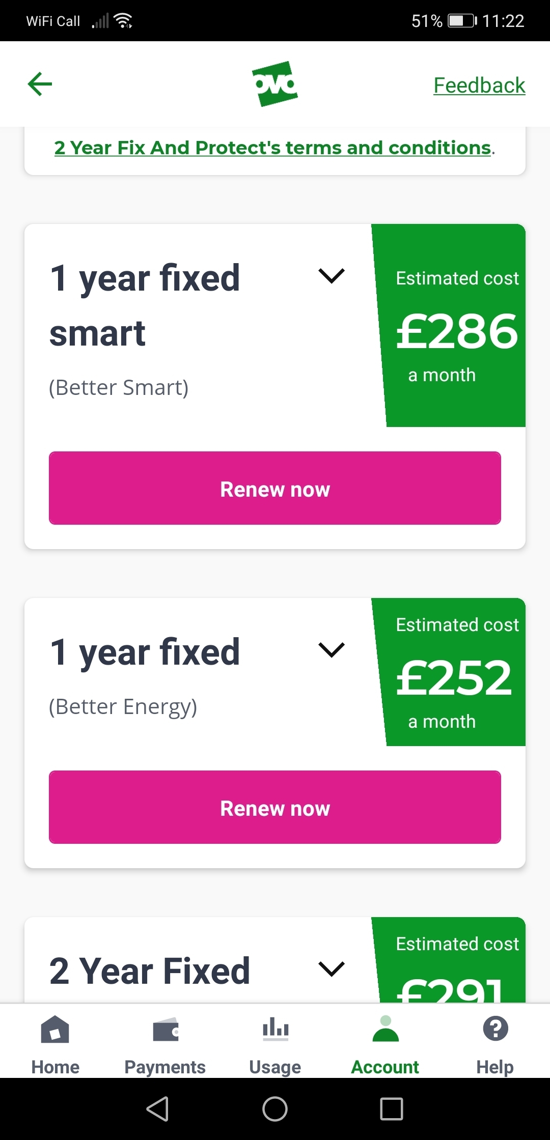
There’s been a LOT of talk about issues with the one-click renewals causing accidental renewals that are later reversed. It may be better to make it a two-step process with some kind of “Are you sure?” check, just to be safe.

Not only does this help to prevent accidents, but it also feels more fair for both OVO and the Member in question, since then you can’t say OVO didn’t warn you.

I think it is also useful as it is not particularly obvious how to see the specific details of each renewal tariff. 

It wasn't particularly obvious to me you have to click on the down symbol.

I could have very easily clicked on renew now thinking I would get further info or even clicked on the renewal button when scrolling on my phone.

Even after clicking on the down arrow you still need to click on the Tariff information label link to get all the information

I think people should be forced to at least see all of this info before clicking a confirm button. 


We’ve had an update on this idea from the team that looks after our online account:


We've listened to customer feedback around this and our team are currently working on a new design. This and making the change has been committed to Q3 so we should see this improved soon. Once we have the designs we can maybe share them as a sneak peek here to get your feedback.


Keep your eyes peeled for that sneak peak! I’ll change the status of this one to ‘Open for Votes’ and when this is delivered we can update it again. Nice work forum members! 


Updated idea statusNewOpen for votes

@Tim_OVO As part of the change, it would also be great if a self service way of cancelling a contract within the 14 days could be added to the app and website.

I am all for self service to free up the Support Team for more important and difficult issues. 


@Jeffus - A really great additional aspect to this idea!


Wonder if this would actually be better posted as separate idea, if you’d be up for creating another idea? 💡


@Jeffus - A really great additional aspect to this idea!


Wonder if this would actually be better posted as separate idea, if you’d be up for creating another idea? 💡

Done


Absolutely agree with this idea.  Happened to me the other day.  I expected to see a breakdown or a confirmation button next as I just wanted to get an idea of pricing etc.

That said the customer service rep was lovely really helpful and changed it back and did say this happens a lot.


A quick update on this idea from the Product team:


We've tried to make our renewal process as easy as we can for our customers, however we understand that this may have caused 'mistaken' clicks.  Customer can cancel any plan change within 14 days, and our team will work on how we can add in additional confirmation without extending customer journeys. 

Thanks @Tim_OVO any chance this will be available before any new fixed rates are introduced? 

I live in fear also that we will see this happening again and lots of worried customers.