Open for votes

Add weekday labels to Monthly usage / consumption view of online account

Related products:Online account

Hello! I'd like to provide feedback about your website.

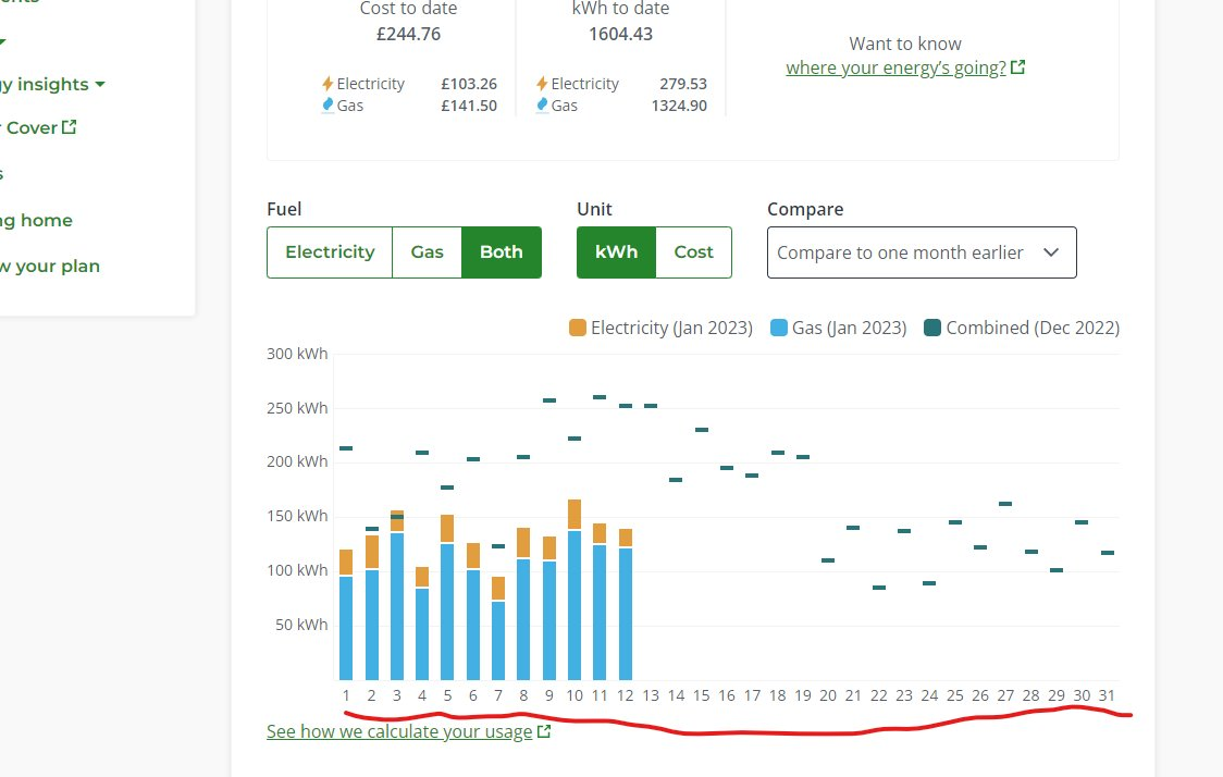
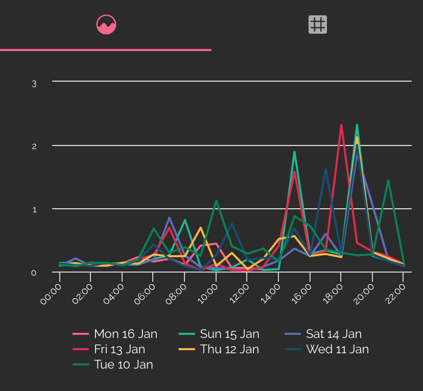
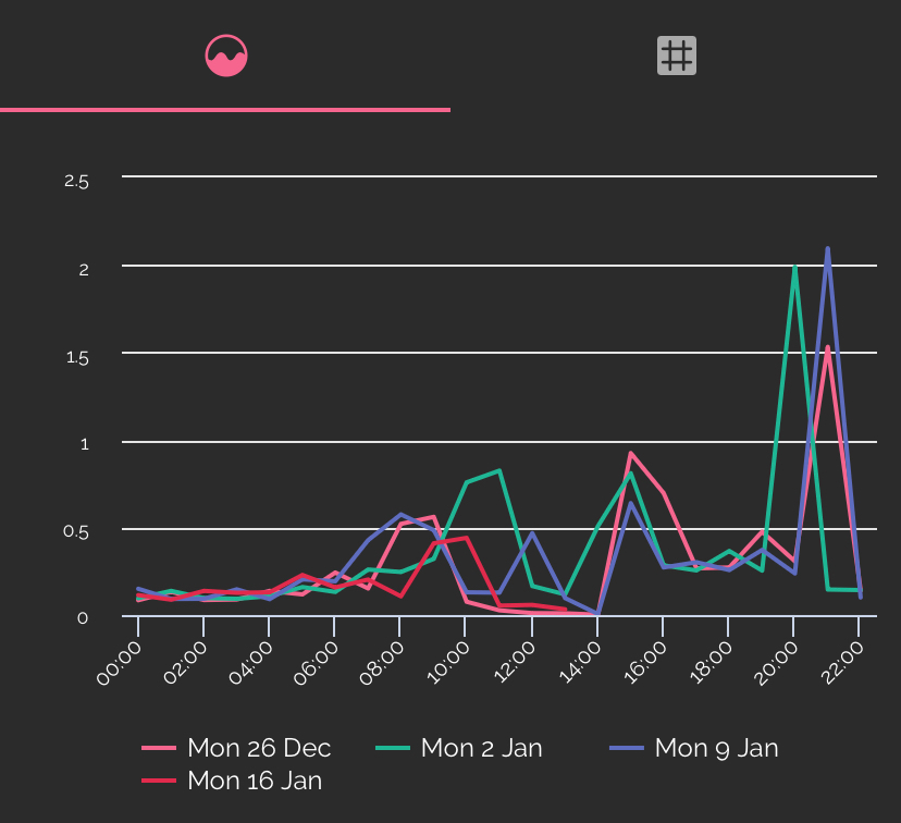
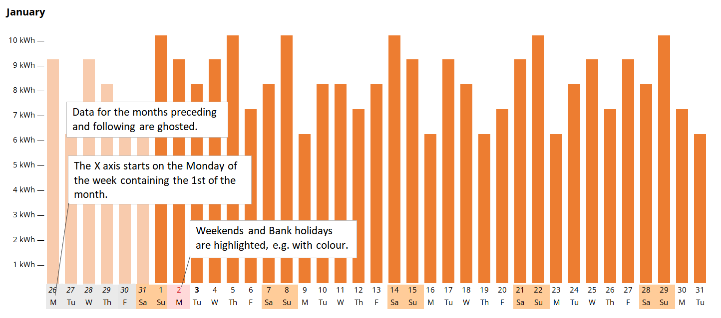
In the https://account.ovoenergy.com/usage page, please show what weekdays correspond to the month day, so that I can figure out my consuption habits over the week and try to save energy accordingly. Thank you!


9 replies

Tim_OVO
Community Manager
  • Community Manager
  • 1864 replies
  • January 16, 2023

Makes sense to me, @anerley.


I’ll change this idea status to ‘open for votes’, which will send it over to our product teams.


Tim_OVO
Community Manager
  • Community Manager
  • 1864 replies
  • January 16, 2023
NewOpen for votes

BPLightlog
Plan Zero Hero
Forum|alt.badge.img+5
  • Plan Zero Hero
  • 2726 replies
  • January 16, 2023

That might be a little confusing to display as on the ‘comparison’ view, you might see two selections of days against each months dates. 
One good way of comparing days against each other is via the Bright Energy app


  • Author
  • Carbon Cutter*
  • 2 replies
  • January 16, 2023
BPLightlog wrote:

That might be a little confusing to display as on the ‘comparison’ view


I actually disagree.

Because when showing weekdays I can still see on the graph how big a difference Friday is vs Sunday, that's besides being able to tell Friday's consumption compared to last month's Friday.


BPLightlog
Plan Zero Hero
Forum|alt.badge.img+5
  • Plan Zero Hero
  • 2726 replies
  • January 16, 2023

That’s fair enough - I guess how it’s displayed will be the thing. 
As I mentioned, using the Bright Energy app you can make comparisons for a week at a time,

month at a time etc or comparing say Mondays

(or whichever day you want). The charts look like this - you can tap a point on the graph to get a value or look at a table of values .. just a suggestion of something available now


Firedog
Plan Zero Hero
Forum|alt.badge.img
  • Plan Zero Hero
  • 2019 replies
  • January 16, 2023
BPLightlog wrote:

… something available now


… for those lucky enough to have a smart meter on the DCC network ☹️


Firedog
Plan Zero Hero
Forum|alt.badge.img
  • Plan Zero Hero
  • 2019 replies
  • January 21, 2023

I agree with @anerley that the Usage charts could be made more useful. Lining up the weekdays would be very helpful, which is why it’s used in many calendar settings. It could easily be done by extending the horizontal axis to at least 37 or perhaps even 42 days, six full weeks. Then each month’s data would occupy just part of the chart. Like this, perhaps (with a 37-day axis):
  

February’s columns would be in the middle of the chart, while May’s would start at the left-hand end. This would indeed involve more horizontal scrolling than at present for some users, but that’s a small price to pay when so many have to scroll anyway. 


I’d also extend this idea by suggesting that the vertical axis remain constant during a session. It is particularly annoying on the Day usage page, when an alarming 300px spike might indicate 5kWh of heating one day and 50wH of heating up a portion of oven chips the next. 

I admit that I haven’t given this a great deal of thought, but I’m sure the designers have and that they may have very good reasons for not applying this sort of refinement. Still, if you don’t ask …


juliamc
Carbon Catcher***
Forum|alt.badge.img+3
  • Carbon Catcher***
  • 1258 replies
  • January 22, 2023

I agree re the vertical axis, a car charging day makes the rest of the usage graph meaningless. 


  • Author
  • Carbon Cutter*
  • 2 replies
  • January 22, 2023

I liked the chart @Firedog brought in the most, it's exactly as if hoped it to be!


Reply


Cookie policy

We use cookies to enhance and personalize your experience. If you accept you agree to our full cookie policy. Learn more about our cookies.

 
Cookie settings