Open for votes

Show the daily usage view, with data from a longer period

Related products:Online account

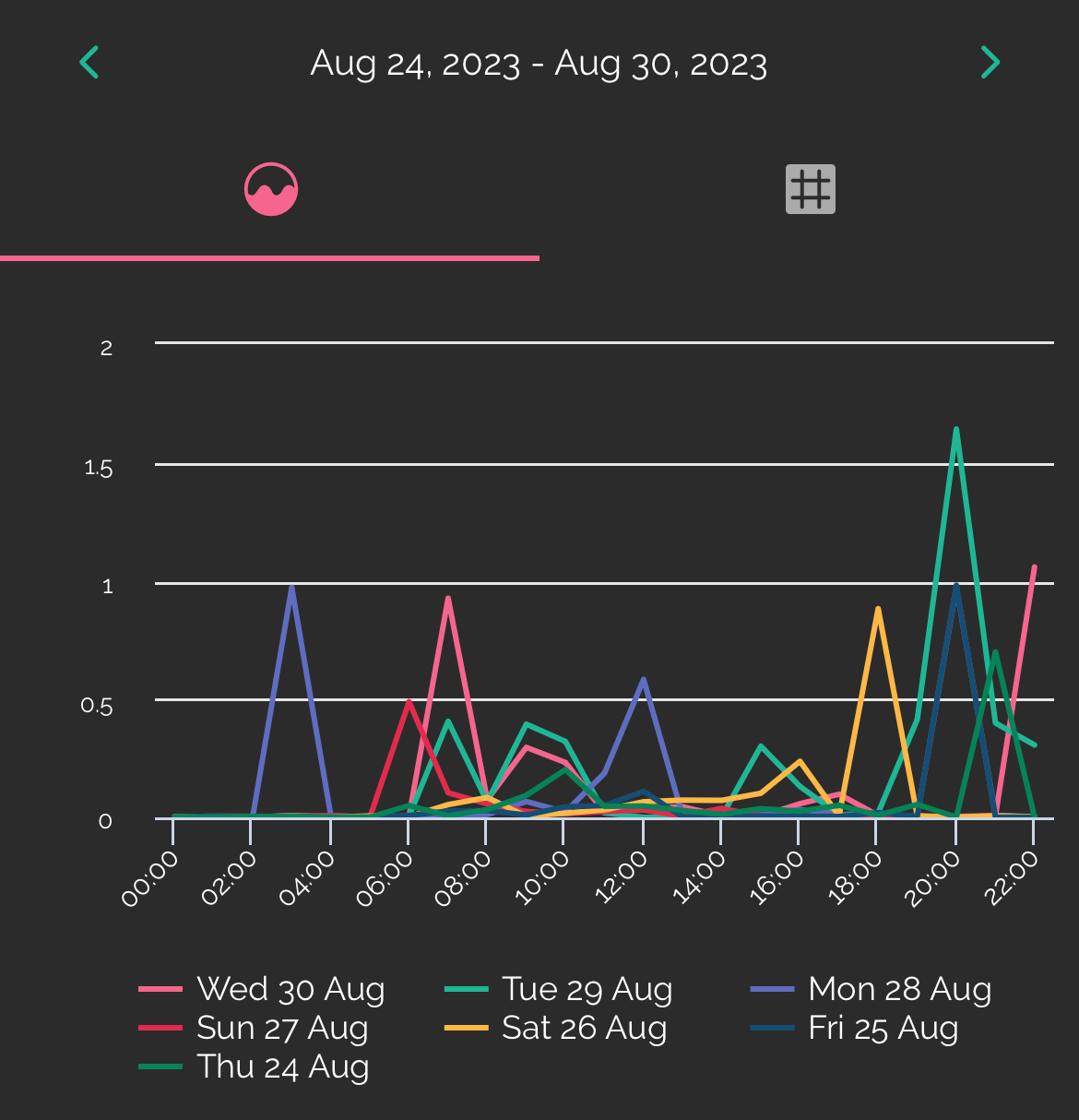
It’s nice to see the energy usage over a day, split into 30 minute intervals.

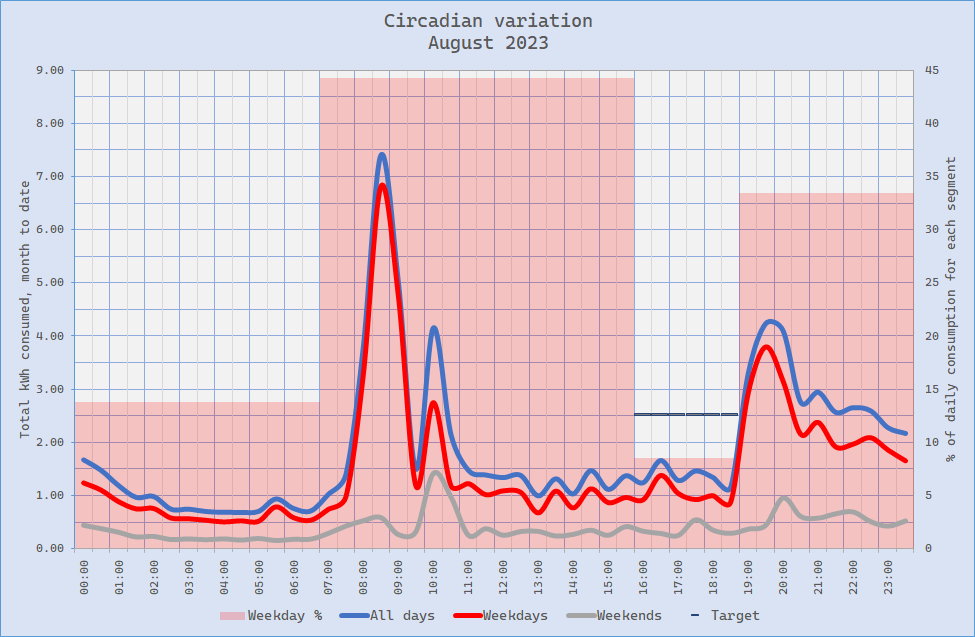
However, it would be Really Nice to see that graph with data from the whole month, or ideally any specified period.  A super-advanced version of this feature would show All Weekdays, Saturdays, Sundays separately.

This seems like an obvious omission: the user’s average half-hourly usage, as distinct from that from a given day, which might not be representative.

7 replies

BPLightlog
Plan Zero Hero
Forum|alt.badge.img+5
  • Plan Zero Hero
  • 2729 replies
  • September 6, 2023

An interesting suggestion @Matt 4567. Some of the third party apps do have some of these features however a whole raft of 30 min data slots for a full year would be quite chunky. 
Bright in particular does allow you to compare days with each other, either in a week or say the last number of Wednesdays. 
For example 


  • Author
  • Carbon Cutter**
  • 8 replies
  • September 6, 2023

No, not 365 x 48 data points, but 48 data points (as at present), each derived from the average of 365 readings.  The illustrated chart shows how to obscure the signal by showing too much data!

365 = whatever time span you are interested in. For simplicity I’d accept [The Selected Month or Year]

//M


BPLightlog
Plan Zero Hero
Forum|alt.badge.img+5
  • Plan Zero Hero
  • 2729 replies
  • September 6, 2023

On the bright app you can switch off (or on) any of the days/lines by clicking on the legend. 


  • Author
  • Carbon Cutter**
  • 8 replies
  • September 6, 2023
BPLightlog wrote:

On the bright app you can switch off (or on) any of the days/lines by clicking on the legend. 
 

how about combine / aggregate / average the data?

I should have been clearer in my original post, I meant “see that [30-minutes x 1 day] graph with data aggregated over the whole month”. 

Vertical units not important (it can be kWh/month or kWh/day or in that 30’ time bin), it’s the general shape that is useful.

I’ll look at the Bright app, but not if it’s more than 10 minutes messing about. Happy to spend an hour on Excel though!

//M


Firedog
Plan Zero Hero
Forum|alt.badge.img
  • Plan Zero Hero
  • 2006 replies
  • September 6, 2023
Matt 4567 wrote:

Happy to spend an hour on Excel though!
 

Join the club, so long as ‘an hour’ can stretch to ‘many hours’ 😉

The data you’re keen to get your hands on are all readily available, but as JSON. Excel (365) does have tools to convert JSON, but I find it simpler just to use ordinary spreadsheet functions (text-to-columns, filters) to make sense of them. It also depends a bit on which browser you’re using; I have Edge, which turns JSON into legible pages natively. Otherwise, you may have to resort to a third-party utility site like JSON Pretty Print

My house is all-electric, so I’ve no experience with gas data. And this all rather depends on the account being on the ‘new’ platform (Orion) and not the older Apollo system. I’m not perfectly sure how you tell the difference, but if you have to use an email address to sign in and your account no. is seven digits, that’s most likely Orion.

Here are some pages to look at:

  1. OREX readings
  2. Monthly usage
  3. Daily usage
  4. Half-hourly usage

To get there, open your account page and sign in. Then, open the other pages in new tabs in the same browser session, where your access token is saved for 30 minutes. If you get an error message, the chances are the token has expired; refresh the account page, sign in again if necessary and then refresh the page you’re trying to access.

In each URL, replace nnnnnnn with your 7-digit OVO account no. 

(1)  shows meter readings for the last 400 days. 
(2)  shows usage for each month in the year given in the URL. Figures are available since the account was migrated to the Orion system (in my case, that happened in January 2020). Similarly, (3) gives data for the month specified and (4) for a specific date.

Alternatively, you could cheat and use a site like JSON to CSV Converter Online!


Firedog
Plan Zero Hero
Forum|alt.badge.img
  • Plan Zero Hero
  • 2006 replies
  • September 7, 2023

PS

I should have included the warning: these raw data use the industry standard of GMT timings all year round. This means that the half-hourly data start at 01:00 BST each day in summertime and end at 00:59 the following day. This doesn’t normally matter much, because there’s not that much variation in ordinary people’s usage at that time of night. However, it could make a big difference if you’re trying, say, to complete a Power Move challenge requiring you to shift usage from the period 16:00-18:59 to some other time. That’s what I’m currently trying to do, so everything is off until 7PM, at which point supper preparation starts. So this is what my usage pattern for August looked like:


I’ll be trying to get rid of that 16:30 blip by making tea at 15:30 instead from now on. In case you’re wondering, the tall morning spikes are thanks to my 9kW electric shower. 


Emmanuelle_OVO
Community Manager
  • Community Manager
  • 2561 replies
  • September 11, 2023
 
Great idea! If third party Apps do this already, I don’t see why OVO couldn’t. I’ve changed the status of this to ‘open for votes’ so we can gauge interest. 😀
NewOpen for votes

Reply


Cookie policy

We use cookies to enhance and personalize your experience. If you accept you agree to our full cookie policy. Learn more about our cookies.

 
Cookie settings