Hi @Rob Foyster , without daily (or more often half hourly) smart readings, their system will estimate usage to give a graphic like you say.
It is only for a guide and as you know, not used for billing.
You could ask for your meter to be updated to give more frequent readings?
Hi @Rob Foyster , without daily (or more often half hourly) smart readings, their system will estimate usage to give a graphic like you say.
It is only for a guide and as you know, not used for billing.
You could ask for your meter to be updated to give more frequent readings?
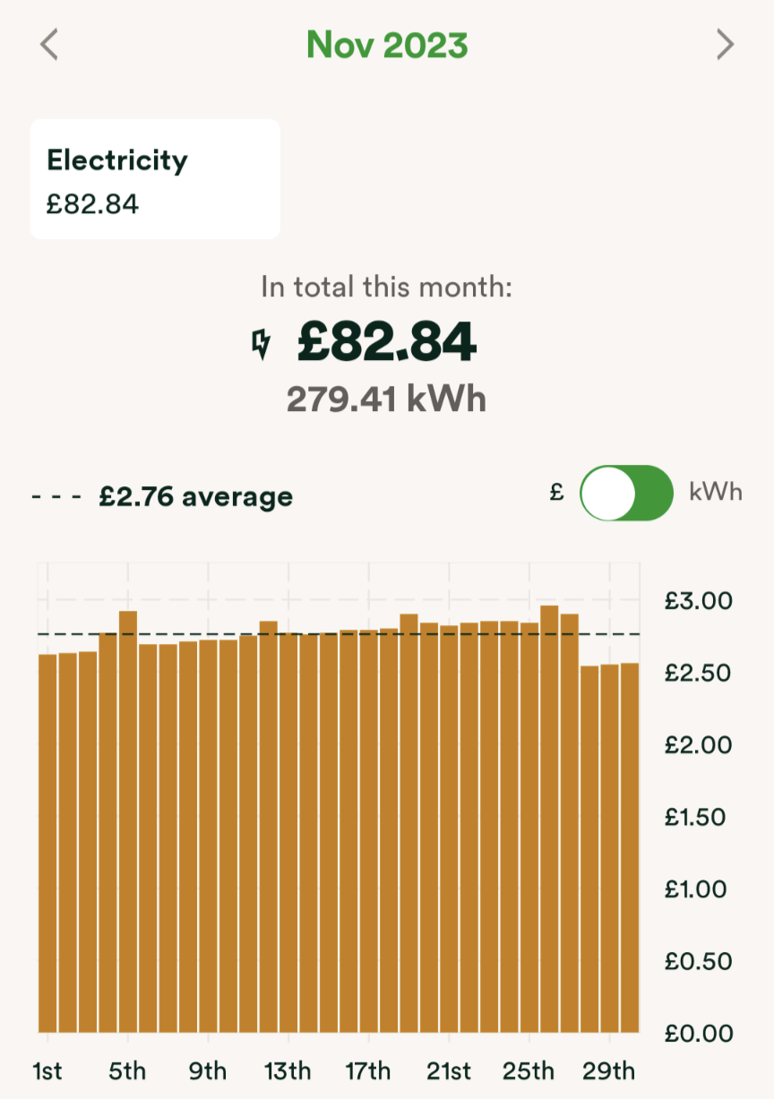
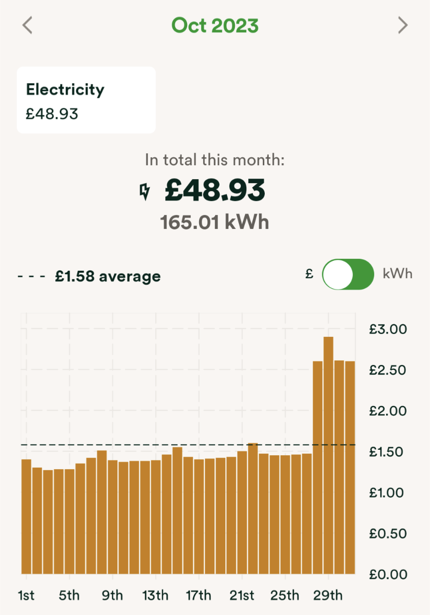
Thanks for the reply. That makes sense that it would average it over the relevent period but doesn't explain for the little fluctuations between each day? If it was going to just average it over the time period the bars should all be the same height? This is what made me think it wasn't doing the average method?
Hi @Rob Foyster , without daily (or more often half hourly) smart readings, their system will estimate usage to give a graphic like you say.
It is only for a guide and as you know, not used for billing.
You could ask for your meter to be updated to give more frequent readings?
Thanks for the reply. That makes sense that it would average it over the relevent period but doesn't explain for the little fluctuations between each day? If it was going to just average it over the time period the bars should all be the same height? This is what made me think it wasn't doing the average method?
Hi @Rob Foyster
The algorithm doesn't smooth the usage so it is same every day, so you will see differences.
It is up to you obviously but you could ask ovo to set your frequency to every 30mins. Then you will see what you are actually using every day.
You can't do this online, so you would need to phone, use chat or you could email.
https://www.ovoenergy.com/help#contact_us_container
If emailing or calling, do it from the phone/email address registered with ovo.
With 30 min readings you also get the option of taking part in Power Move and Power Move Plus in the future if you choose to, also potentially any clever tariff OVO may launch in the future.
That … doesn't explain for the little fluctuations between each day?
I don’t know, but I suspect that the estimates for daily usage vary from day to day in line with variations in previous weeks, just to make them look less artificial.
… i can't understand the spike around 28th Oct.
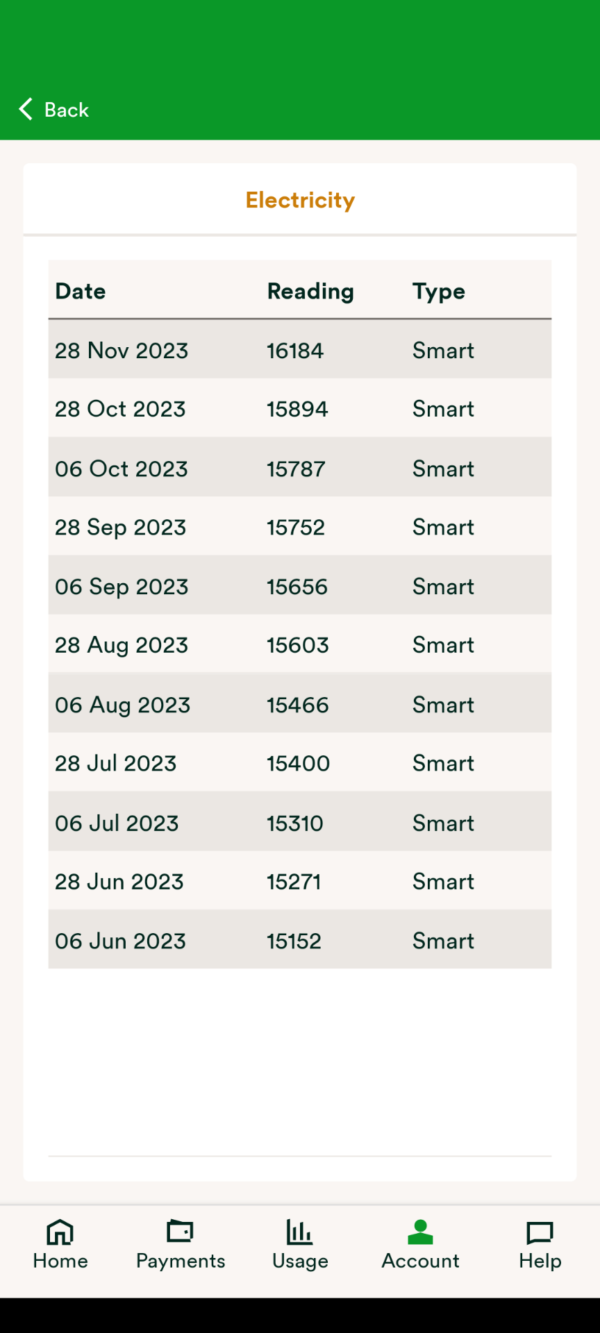
Your November usage according to the readings was twice what it was in October (290 kWh compared to 142 kWh), so there was bound to be a jump.
I’d heartily endorse Jeffus’ suggestion to move to a half-hourly reading frequency. You’ll get a much clearer picture of your usage.