A Thirst For Data: My Guide to third party Apps

  • 30 November 2022
  • 8 replies
  • 517 views

Userlevel 7
Badge +5

I put together a guide to a few of the 3rd party data feeds which are now accessible with a smart meter to view your energy use.

I also have been looking at a few other things to explore a little more as, has been pointed out in the Power Move trial, it is mainly with more information that users can make more informed choices.

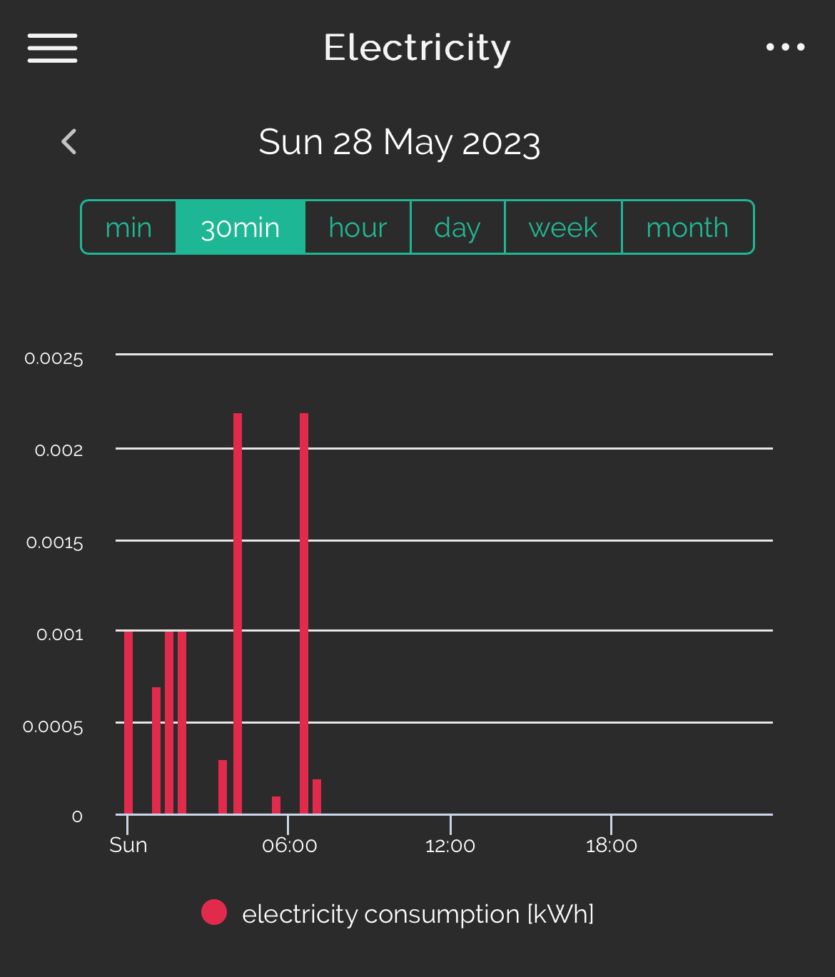
One thing on the Bright energy app is a comparison chart which allows you to see power use during the day. It also allows you to look deeper across days of the week 

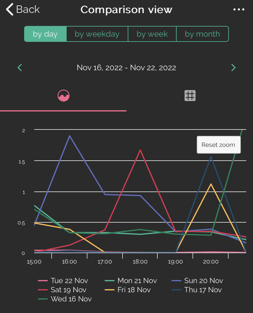
and for the same day over a number of weeks 

Bright Energy app comparison view

One thing which isn’t very well explained but shown in the 2 images above is that you can zoom into the image to see the time frame required in more detail. This is simply done by ‘pinching’ the image as often used on smartphones these days.

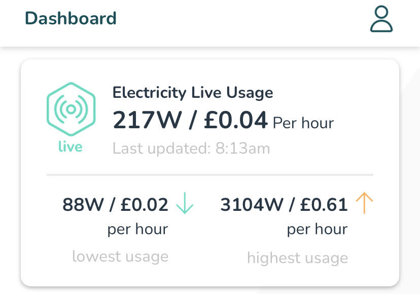
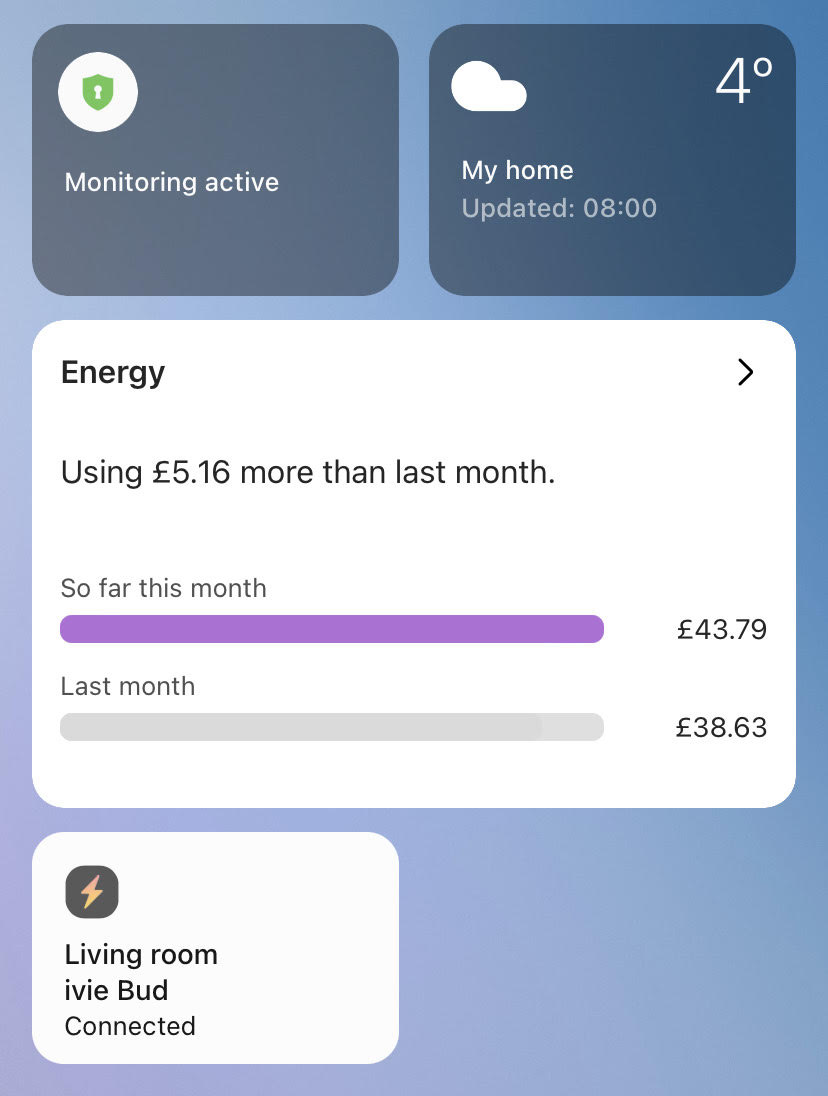
Now that ivie bud is working more consistently alongside the ivie app, you can get an instantaneous electricity use reading together with low and high readings for the day. 

ivie app feed via ivie bud IHD

As I’ve shown elsewhere, this also links into the Samsung app ‘SmartThings’ which can combine several feeds to begin to show temperature, home monitors alongside energy use 

SmartThings app

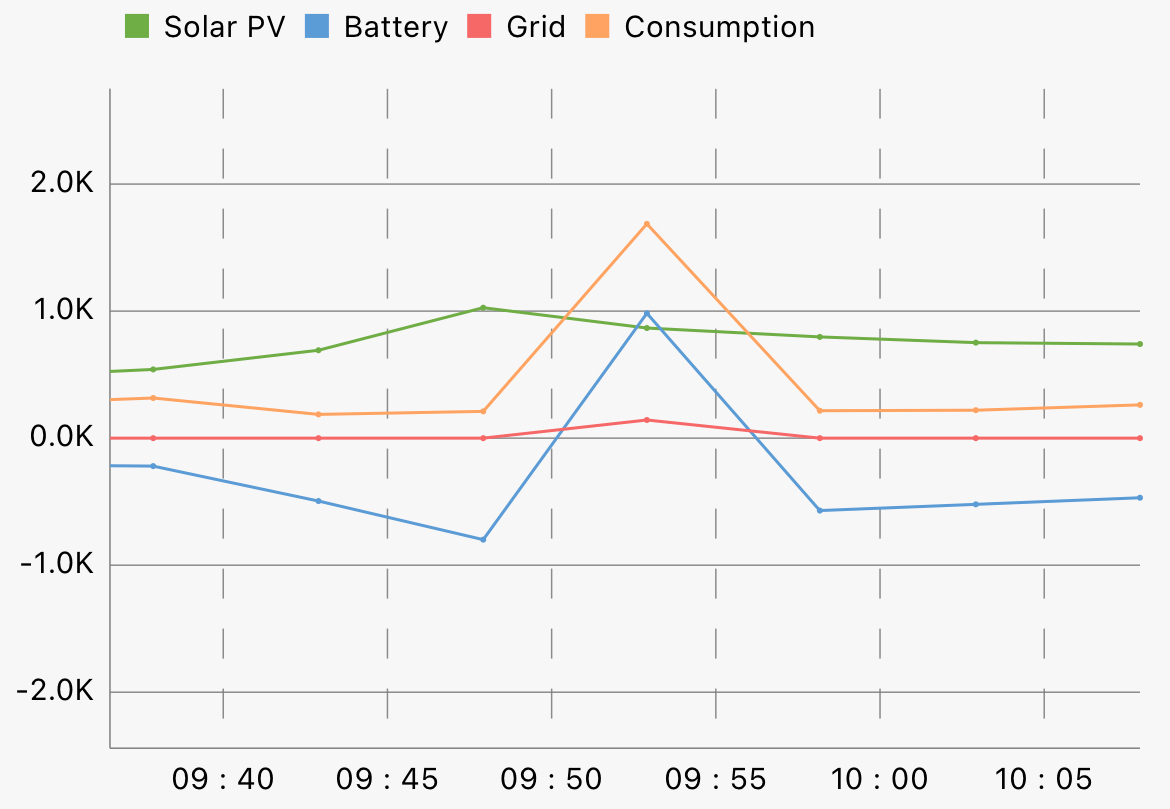
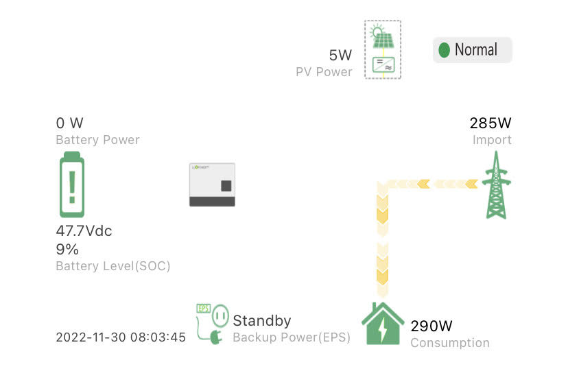
A few other feeds not currently integrated are one for our solar PV and battery storage system. This is important to see what’s going on and here for example my battery has dropped below 10% which is deemed to be a minimum level and so I know that I will probably need to charge the battery today (unless the sun makes an appearance) 

Solar PV and Battery Storage

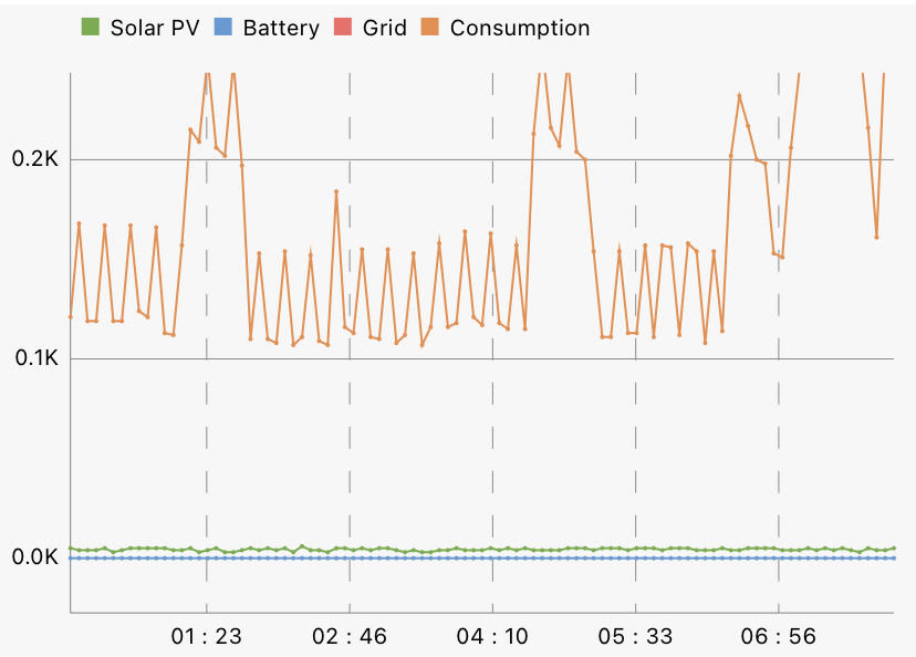
This feed also shows what electrical energy is used during each day and allows me to look at my phantom load which currently is just over 100w .. not bad but could be lowered. 

Overnight consumption showing ‘Phantom Load’

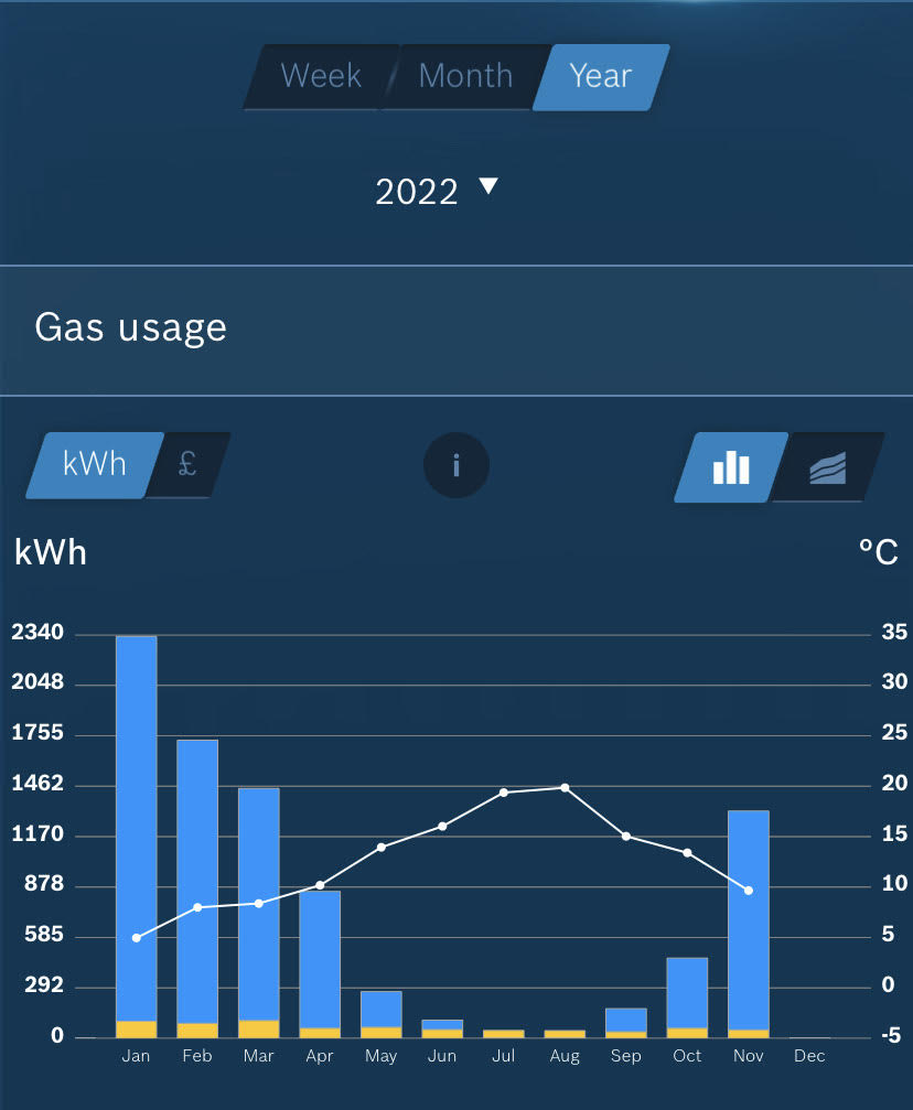
Also monitored is my central heating and hot water via a Smart Thermostat - this also has a local record of temperature 

Central Heating and Hot Water use via Smart Thermostat

and finally I also monitor temperatures and humidity levels in areas of the house although these are on a totally separate feed.

There is certainly scope to bring this into a more integrated system and I note that SmartThings lets me do some of this, even giving me alarms when certain conditions are met .. at present it tells me if my electricity feed exceeds 3kW, the limit for my battery system.


8 replies

Userlevel 7

So great to see these various user interfaces!


I also have been looking at a few other things to explore a little more as, has been pointed out in the Power Move trial, it is mainly with more information that users can make more informed choices.


Lots of places to see different data visualised, all helpful and informative. Perhaps one day something will bring it all together in one place…


Overnight consumption showing ‘Phantom Load’


Do we think that’s the fridge/freezer cycling on and off, @BPLightlog?

Also there is no grid consumption line…. is the overnight consumption from the grid? 

Userlevel 7
Badge +5

So great to see these various user interfaces!


I also have been looking at a few other things to explore a little more as, has been pointed out in the Power Move trial, it is mainly with more information that users can make more informed choices.


Lots of places to see different data visualised, all helpful and informative. Perhaps one day something will bring it all together in one place…


Overnight consumption showing ‘Phantom Load’


Do we think that’s the fridge/freezer cycling on and off, @BPLightlog?

Also there is no grid consumption line…. is the overnight consumption from the grid? 

Yes @Tim_OVO it has to be the fridge and a little chiller too. It is from the grid, I’d just cropped the image to show the power scale better. It’s really surprising what power is used overnight if things are left on standby

Userlevel 7
Badge +5

A quick update on this topic and in particular the data from my Hildebrand/Glow IHD and the Bright app .. I had not realised quite how much information was available until recently. Now that my solar PV covers much of my electricity usage, I get to see small levels when switching occurs which the system doesn’t completely control and this morning there were some very small usage levels shown below what I expected to be recorded. 

This is in 30 min slots from midnight and the levels measured vary between a tenth of a watt to just over 2 watts where an increase in demand hasn’t been fully covered by the batteries. Quite a lot of detail which is useful when reviewing  

Userlevel 7
Badge


I can’t see that anyone has commented on the curious scale on the ‘x’-axis here. It looks as if the timed abscissae are at 5000s intervals (5ks?), while the blobs on the axis denote 300s (5 minute) periods. We have a lot to blame the Babylonians for!


Userlevel 7
Badge +5


I can’t see that anyone has commented on the curious scale on the ‘x’-axis here. It looks as if the timed abscissae are at 5000s intervals (5ks?), while the blobs on the axis denote 300s (5 minute) periods. We have a lot to blame the Babylonians for!


The interval between recording points is 5 mins for this feed but in this particular case, it’s probably the zoom factor I left the scale at for the screenshot 😬

Userlevel 7
Badge

The interval between recording points is 5 mins for this feed but in this particular case, it’s probably the zoom factor I left the scale at for the screenshot 😬


Yeah, but you surely agree that 5ks is a curious division to choose, especially since it’s not a multiple of the minor divisions.

Userlevel 7
Badge +5

The interval between recording points is 5 mins for this feed but in this particular case, it’s probably the zoom factor I left the scale at for the screenshot 😬


Yeah, but you surely agree that 5ks is a curious division to choose, especially since it’s not a multiple of the minor divisions.

Yes, understood but they use a dynamic scale which depends on the latest data point. So for example if I zoom in today it can show something like this 

The main negative is the inability to fix a max power level to view so if there is a significant high point during the day, it swamps the rest of the info although I can zoom to see additional detail. 

Userlevel 7
Badge

The main negative is the inability to fix a max power level to view so if there is a significant high point during the day, it swamps the rest of the info although I can zoom to see additional detail. 

Yep, it’s a universal problem - well, it affects OVO and Bright too. Really annoying.


Reply