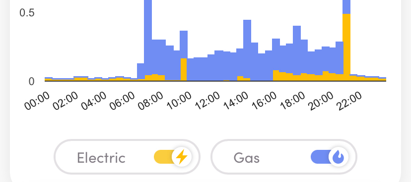
There are a number of third party data sets now available gathering info from smart meters so I thought I’d give a few a go to see what they offer. As has been mentioned, the OVO info screens are useful but could be enhanced but what about the others.
Loop Homes
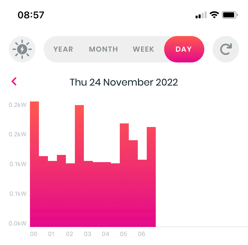
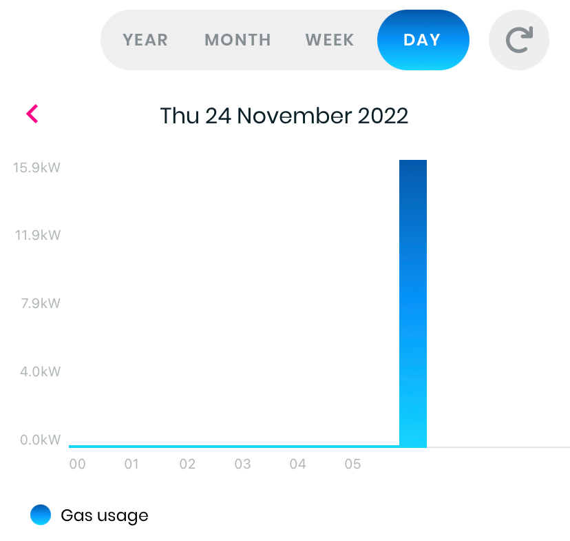
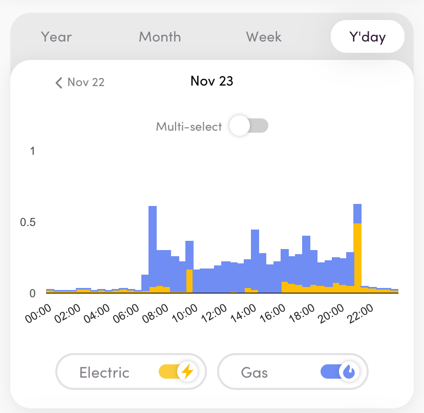
Loop - a useful and quick series of data which are updated during each day keeping track quite efficiently. This offers not much more than that apart from a solar PV and battery storage simulator but always a go-to for quick info. For some reason, gas always lags electricity by half a day or so. Loop are also running a peak hours reduction trial at present (2022-2023)
(example screens)
Loop does also have a solar PV and battery storage simulator which can give an idea of possible energy savings with these technologies. You can switch these on and off and also view a calculated kWh saving - however, if you already have solar panels or batteries you will get a false picture as the app doesn’t currently allow you to indicate this
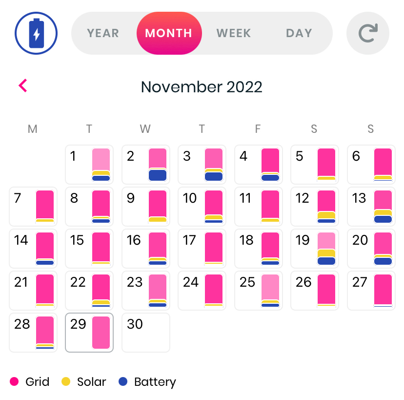
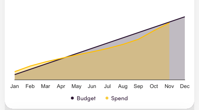
Hugo - a nice series of data screens but nothing for current day. It also has a budget tracking option to look across the year and project to year end. Good for a few different perspectives on the data. Generally always full and available the next morning
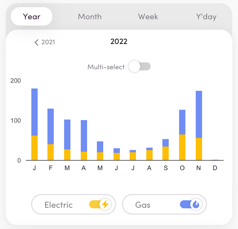
An interesting data prospect (below) looking at a track of spend to projected budget
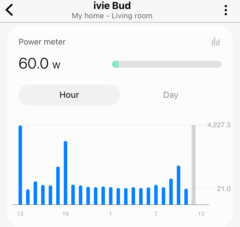
Ivie App - a newer option but currently it struggles to get data. It tends to take a day plus several hours and so it is not currently that useful although when complete, the detail on each day, week or month looks good comparing to expected use. This also has struggled to get any previous data from when initiated and so there is not much to look at currently. Hopefully this will sort itself out and also link to the ivie bud for a more complete feed.
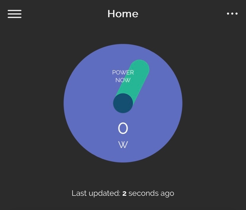
There is a live feed from the IHD to the ivie app (when working)
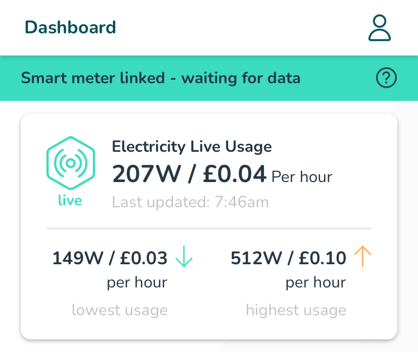
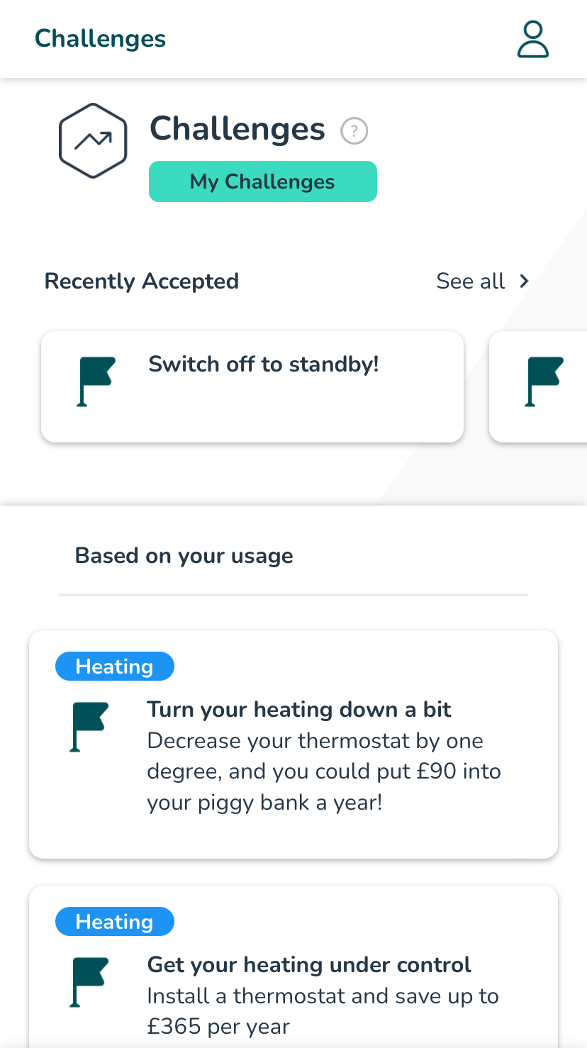
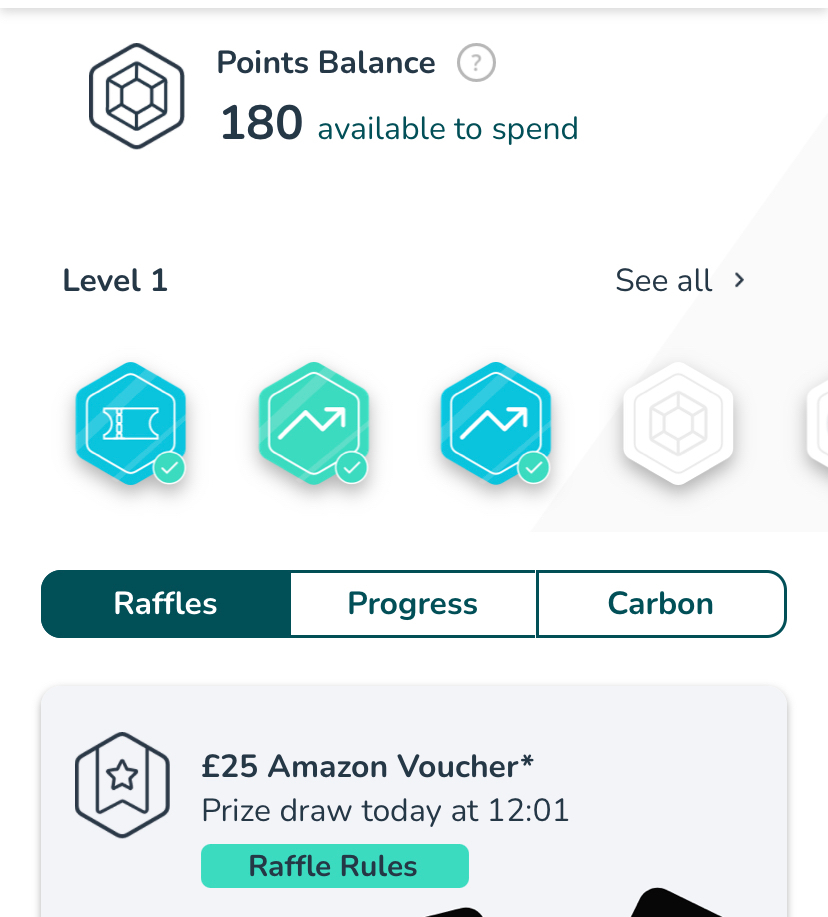
This ticks a box for something I’ve been looking for for a while. I’m still exploring but also like other parts of the dashboard with energy insights and points to be gained by accepting and completing energy saving challenges
There is also a link to SmartThings which has various other options to monitor home appliances, lighting, cameras, smart plugs and other connected devices Currently this looks useful to view high usage slots within a week and even day.
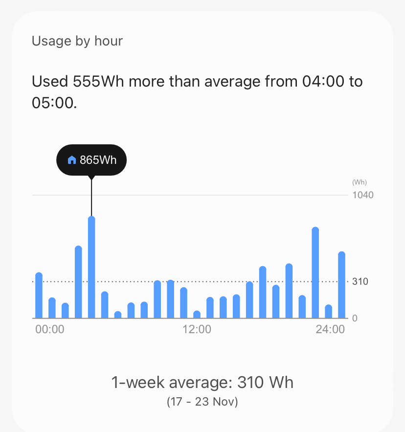
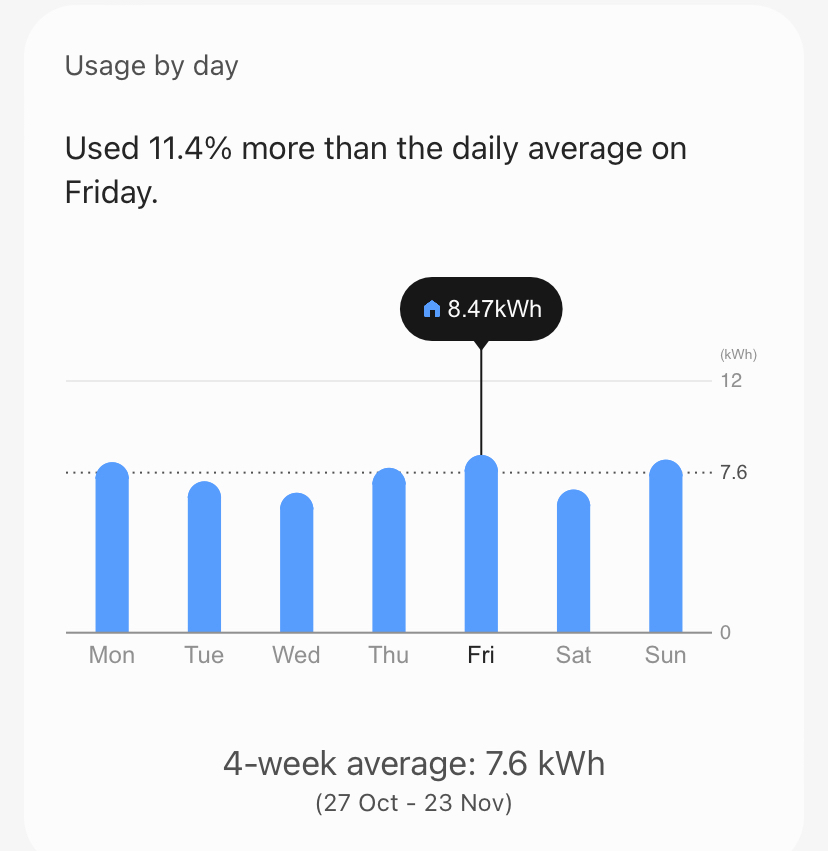
There’s also an hourly feed from the links with chameleon and ivie bud which scrolls through the hours giving an instantaneous reading and a more complete day’s view
Another app which also offers its own display (to purchase) and link to some useful current data. Although the front dashboard is active for the day, it is very text heavy which in my personal view is not as easy to read.
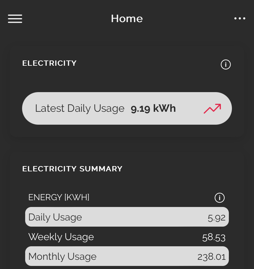
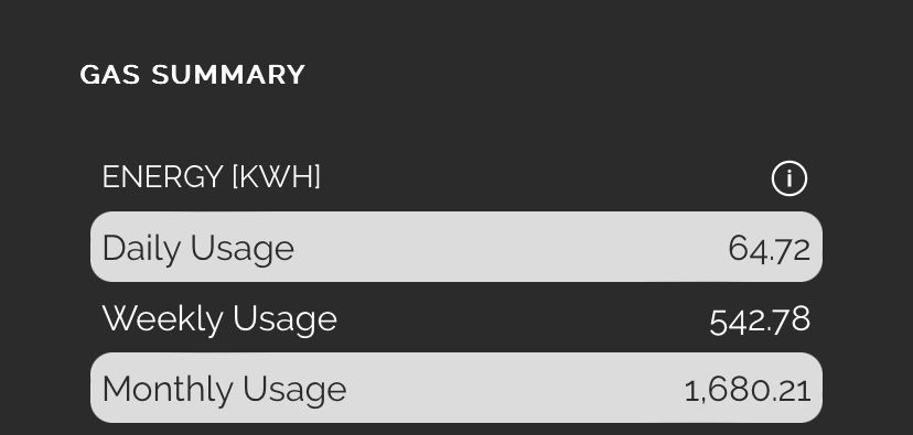
The rest of the information is very good, giving graphical representations of data daily, weekly and monthly and also available as hourly and half-hourly views.
The most useful of these is a comparison view so that the user can judge their use from previous records
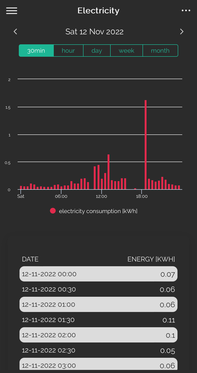
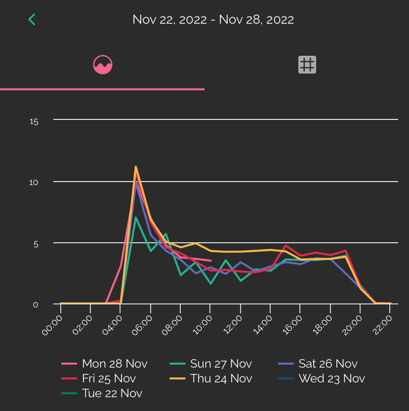
Update: not well documented but there are options on the Bright data screens to zoom in by pinching the screen on a mobile or tablet in the normal way which can help to look at specific time slots more closely. Also I have recently discovered that you can switch off a days data on the comparison screen by clicking on the key dates - this is an extra useful feature when comparing days against each other like this
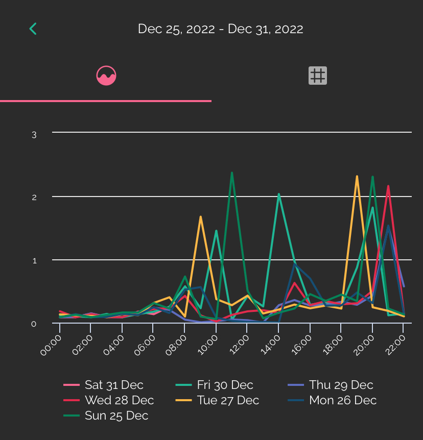
A complete week in comparison view
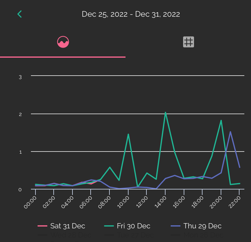
Reduced days in comparison view
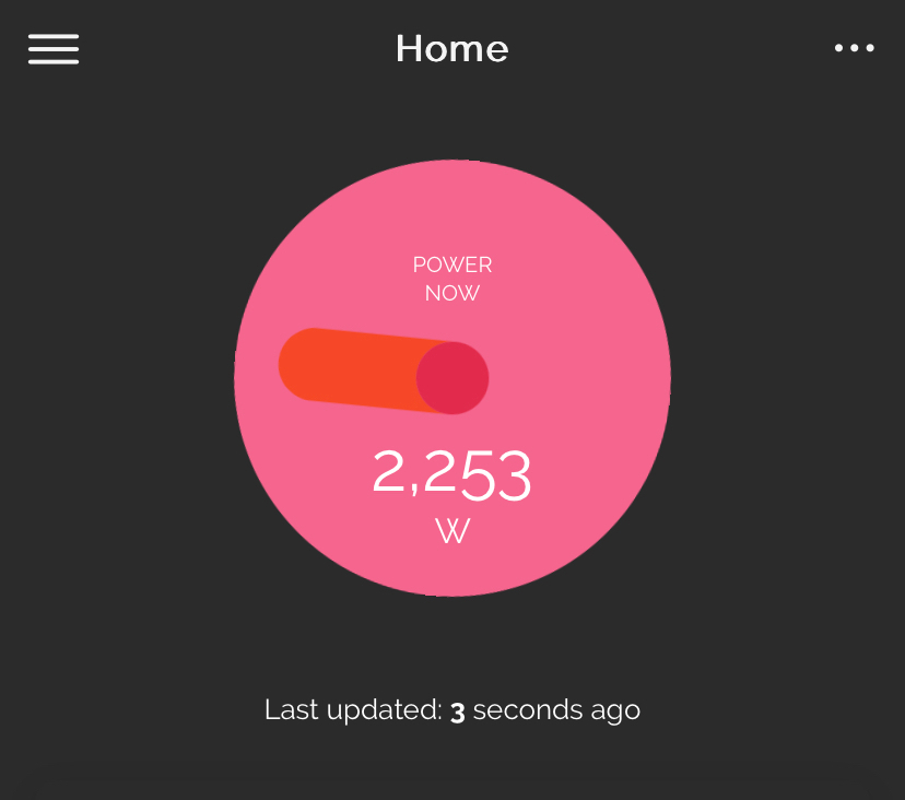
Bright also have an IHD which I’ve just acquired. It looks like it gives a great deal of extra information, links to the Bright app and gives a graphic display of instantaneous use. It also feeds a minute feed to the Bright app graphics which I will report on shortly.
Note : Using several of these at once appears to bring some sort of conflict in data acquisition but the whole area of gathering and displaying data is currently in its infancy therefore I would expect it to become a comprehensive offering in the next few years .. perhaps even integrated into the offering from your energy supplier.
