
Want to see how you are doing during the month?

  • November 12, 2023
  • 8 replies
  • 605 views

Information is power!

I see a lot of posts on here from people complaining that they can’t hit the target or not knowing what they need to do to get on target.

If you:

  • Don’t know whether you are on track or not
  • Don’t know why you are missing the target
  • Want to know what more you can do to get/stay on track

Then you are welcome to use my spreadsheet (click here) to help you take control.


Instructions:

  1. Set parameters (currently set for Autumn PM Challenge)
  2. Download data from Glowmarkt and paste into the appropriate sheet
  3. Adjust the size of the Calculations table to accommodate all the data up to the end of the last full day’s data (you can leave a part day but it will give a zero reading for that day at the end of the graph)
  4. Right click anywhere on the pivot table and click Refresh
  5. View monitoring chart.

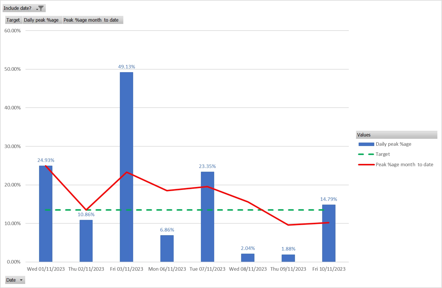
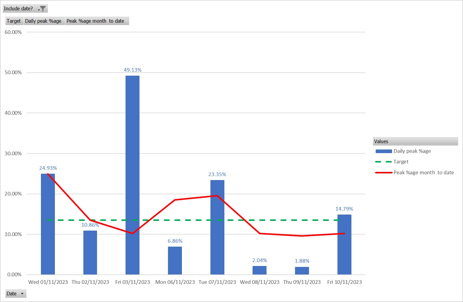
I update every Sunday so that the data will show me the full set of weekdays for the week gone by. Here is my progress so far for October:


I hope you find this helpful.


Kind regards,

Simon

8 replies

  • New Member***
  • November 12, 2023

I haven’t looked at the spreadsheet and it’s a great idea, but the red line doesn’t make sense to me as being month to date peak use. Surely it should go up on 3/11 and down on 4/11 unless I’m missing something?


waltyboy
Plan Zero Hero
Forum|alt.badge.img+2
  • Plan Zero Hero
  • November 12, 2023

As the red line represents peak percentage maybe it doesn’t reflect the highs and lows in the OP’s overall daily usage, only the peak/whole day percentages?


  • Carbon Cutter*
  • November 12, 2023

This looks to be a great idea, thanks for sharing.

(Does this work using the standard data directly from your OVO account, or do you need to buy a Glowmarkt in-house device?)

Having asked the above question I’ve done a bit of research, so for the benefit of those that don’t know:

This works using your current In Home Display (IHD), the display unit provided when you had your Smart meter installed. You just enter the unique code (MAC address) from the back of the IHD into the free Bright Energy app.


  • November 12, 2023

I haven’t looked at the spreadsheet and it’s a great idea, but the red line doesn’t make sense to me as being month to date peak use. Surely it should go up on 3/11 and down on 4/11 unless I’m missing something?

D’oh! Of course you are right. I made a booboo copying a formula.

Here is the corrected graph.

N.B. I have checked the file that I shared and that is okay.


Thanks for spotting my error.


Simon


Nukecad
Plan Zero Hero
  • Plan Zero Hero
  • November 12, 2023

@Simon 1402  talking of booboo’s you might want to edit the thread title if you still can.
(Alert a Mod if you can’t, they should be able to take the ‘p’ for you, LOL).


PS. All you who are ‘doping during the month’ - no spliffs between 4-7


  • Carbon Cutter****
  • November 12, 2023

To be honest I just  sign in to my account and look at my daily use and make sure my numbers between 4 & 7 are lower than the rest of the day, With rechargeable battery lights, recharging laptop & ipad to use for TV & radio at that time I hit the maximum. Its worth it I am 15 days into ,my billing period and my total charges so far with the cash back is £6.3p  thats less than the standing charge. 


waltyboy
Plan Zero Hero
Forum|alt.badge.img+2
  • Plan Zero Hero
  • November 13, 2023

Cheers @Simon 1402 I’m always interested in people’s suggestions for monitoring /saving energy, in view of energy costs and environmental pressures, and especially because of these Power Move incentives, so thank you for your spreadsheet workings. There’ve been one or two others along similar lines on the forum, all very interesting for pencil and paper johnnies like myself!
 

I certainly don’t think spreadsheets, or Excel in particular let us say, are solely in the domain of computer specialists, if they ever were, but are pretty well accessible to us all nowadays. Except, it’s years now since I’ve used my (Windows) laptop as, after I retired, I found my iPad covered most of my bases. But encouraged by yourself and other users here, I might just dust the old laptop off and fire it up one of these days!!


Yesterday I downloaded the Bright app and I’m looking forward to seeing how it presents my usage figures, it goes as far back as when your SMETS2 meter was installed (13 months maximum) …it won’t work out weekday peak hours percentages, of course, but, like @Sally123 @Will R and @IanFerguson I have been relying on checking my usage account figures “manually” (pencil and paper!) from time to time and I’m hoping the Bright half-hourly histograms will give me an alternative nice strong visual representation of how I’m doing as the month progresses. I dare say eventually our OVO account usage pages will adopt a similar methodology, but until then!


Cheers again….


  • Carbon Cutter****
  • November 13, 2023

Thanks for your support @Will R . If this was a permanent scheme I could understand a need for such obsessive monitoring. I may have been over-agressive in my criticism of @simon1402 but at the end of the day it's not a contest with a winner and a loser and like many other similar schemes only benefit those who have the time to constantly monitor their usage.

As you sensibly state, you can switch your usage between peak and off peak or you can't. No amount of spreadsheets, graphs etc. are going to change that.

Biggest pleasure of being an angler is reeling them in. Must get a bigger keepnet!