

Help shape how we show energy use
We’re working on some new features in the Usage screen and would really appreciate your input. We’re trying to understand how valuable it is to be able to compare your home’s energy use to a benchmark.
Here are two early ideas for how this might work. We’ve recorded a video for each to show all the features we’re thinking about including.
As you’re looking through these, please share your thoughts on:
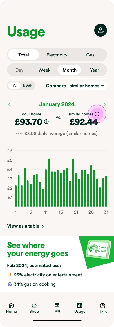
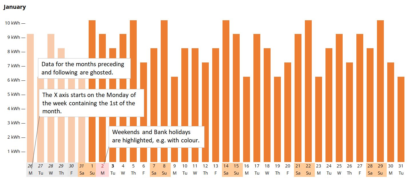
The chart
- How has the usage chart and filters changed? Please expand on what this feature idea lets you do and if there’s anything that’s missing or isn’t clear.
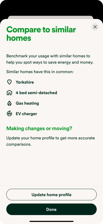
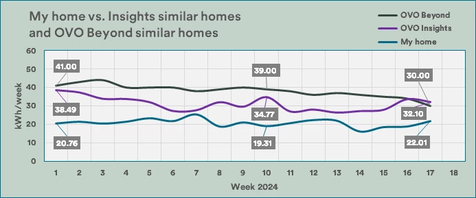
Comparison data shown on the chart
- How valuable is it to compare your home’s energy use to similar homes? Is there any other type of comparison that would be more valuable, or do you not see the value of this at all?
New version of Usage by category
- How useful is it to see your energy use by category as shown in the videos? Is this a feature that would help you understand your home’s energy use better, or is this something you don’t see the value in?
- Any thoughts on the way we’ve displayed this using coloured bars?
- How useful are the tips?
- How does the second feature idea compare with the first option?
Overall thoughts
- Anything else you’d like to share?
Thanks,
The OVO Team


")