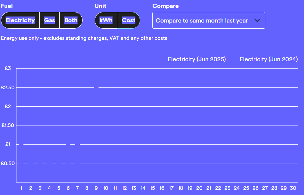
Usage chart unclear on windows 11
Solved
Usage chart unclear on windows 11
Best answer by Nukecad
That blue background (and blue usage bars) in your screenshot is certainly unusual.
What colours did you see for them in Win10?
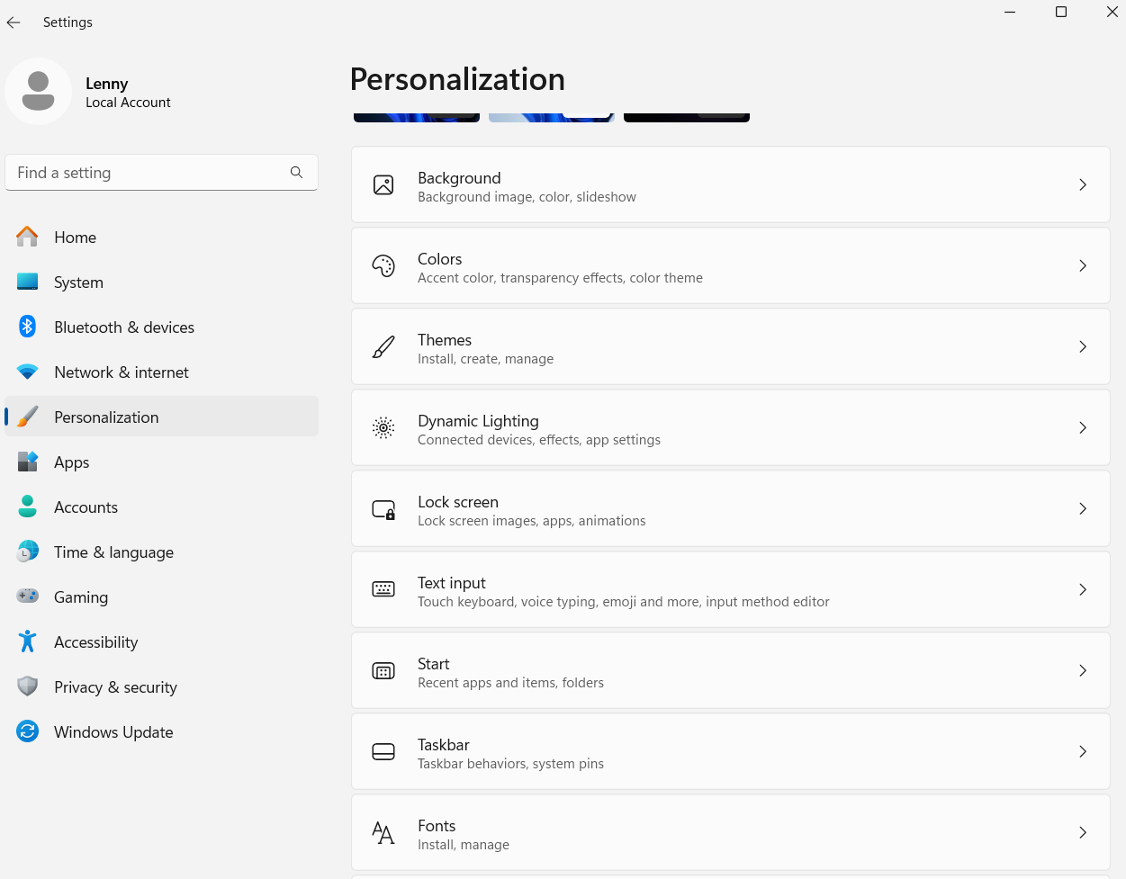
Noting that this is a new install of Windows 11 have you been experimenting (playing) with the settings, in particular the Personalisation settinge for Colors or themes?
Or possibly the Accessibility settings?
Although if you had then I’d expect it to show up in more than just the OVO portal.
Are you seeing any colour issues anywhere else?
We may need more information, such as is this a Laptop or a desktop setup?


Log in to the OVO Forum
No account yet? Create an account
Enter your E-mail address. We'll send you an e-mail with instructions to reset your password.
Contact us
Tips & advice
Resources
For business


OVO Energy Ltd, Floor 5, Crescent, Temple Back, Redcliffe, BS1 6EZ, (Company no. 06890795) registered in England and Wales.
OVO (S) Gas Limited is registered in England and Wales (Company No. 02716495) at Floor 5, Crescent, Temple Back, Redcliffe, BS1 6EZ.
OVO (S) Gas Limited is part of OVO Group Ltd